
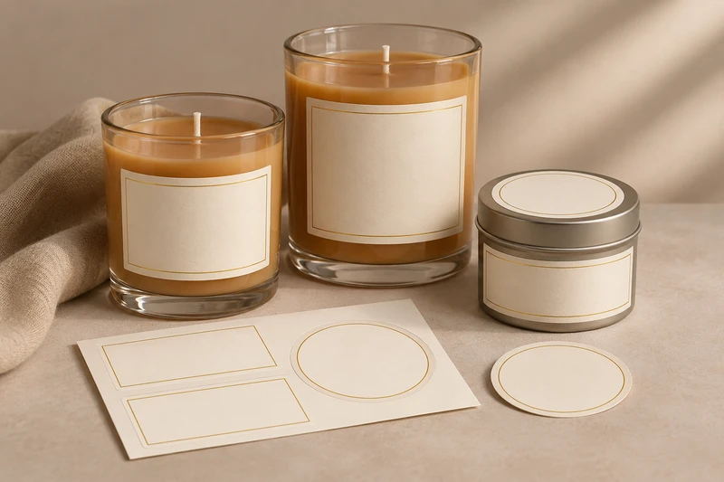
For candle makers, the right candle label size begins with the usable area of the actual jar or tin—not a preset dimension copied from another container. Measure the panel where the label will sit, allow clear space from curves, seams and edges, then build the artwork around the scent name, brand and approved product information.
For packaging buyers in the United Kingdom, this approach helps prevent a common problem: a label that looks balanced on a flat digital proof but appears crowded, creased or difficult to read once it is applied to a filled candle container. XGolden Print designs and produces custom labels and stickers for jars, bottles, boxes and bags, with artwork support, material selection, sample approval and agreed roll or sheet formats available for the project.
Start with the usable area on the candle container
The usable label area is the smooth, uninterrupted part of the candle jar, tin or lid where a label can be applied cleanly and read at a glance. It is usually smaller than the container’s overall width or height.
For a candle jar, identify the section between the base curve and the shoulder, rim or lid line. On a tin, look for the flat sidewall, the top of the lid and any uninterrupted space on the base. Avoid assuming that the full visible surface can accept a label: rolled edges, embossing, seams, raised logos, steep curves and changes in diameter can all affect placement.
A practical way to establish candle label sizes is to use a paper mock-up before finalising artwork.
- Measure the height of the smooth panel. Measure from the point where the lower curve begins to the point where the upper curve or shoulder begins.
- Measure the available width. For a front label, measure the intended front-facing panel rather than simply using the full circumference.
- Mark obstacles. Note seams, lid overhangs, moulded details, ridges, handles and any existing decoration.
- Cut a paper shape to the proposed label size. Wrap or position it on the empty container to see whether it sits flat and leaves an even margin.
- Check it from normal viewing distance. A label should be legible when the candle is on a shelf, in a gift box or photographed for an online listing.
Use the actual production container where possible. A nominally similar jar may have a different shoulder shape, surface finish or base profile, changing how a label sits.
Measure each candle variant separately
Different candle sizes, vessel colours and wax fills may need their own label layouts. A label that works on a large straight-sided jar may not suit a smaller vessel, a tapered glass, or a travel tin. If the product line includes several fragrances, decide early whether every variant will share one label shape or whether the container dimensions justify separate artwork templates.
The same principle applies to candle gift sets. Where several candles are packed together, the front label may identify each fragrance while the outer box carries the broader collection name, gift message or product range information. The label remains part of the primary container presentation; it does not replace the retail or transit protection provided by an outer pack.
Front-label size on straight and curved jars
A front candle label should be large enough to establish the brand and scent clearly, but modest enough to follow the shape of the container without looking forced. There is no universal front-label size for candle jars. The best choice depends on the vessel’s straight panel, curvature, label shape and hierarchy of information.
Straight-sided jars usually offer the simplest front-label area. A rectangular, square, oval or custom-shaped label can sit centrally, with visible glass or tin left around it to frame the design. A wider front label can work where the surface remains flat enough across its full width, but it should not run into the curved transitions at either side.
Curved jars require more restraint. As a label extends around a rounded container, its outer edges may move into a curve. This can make fine type look distorted, cause the label to lift at the edges, or create an uneven visual line. A narrower label with generous clear space is often easier to centre and read than one designed to occupy most of the visible circumference.
Tapered jars need particular care because the diameter changes from top to bottom. A rectangular label may appear less even on the surface than it does on a flat proof. A shape designed around the usable panel may be preferable, but its suitability should be checked on a sample rather than assumed.
| Candle container use | Label focus | Practical sizing and layout requirement | Points to confirm |
|---|---|---|---|
| Straight-sided glass jar for retail | Brand, fragrance and product line | Centre a front label within the flat or near-flat panel; leave a visible margin around the label | Available panel height, front width and final artwork hierarchy |
| Rounded or curved jar | Clear front-facing identification | Keep the label within the most stable central area rather than wrapping too far around the sides | Degree of curvature, edge behaviour and legibility |
| Tapered candle jar | Brand presentation without visual distortion | Test the proposed shape against the changing diameter before approving the layout | Container profile and final label shape |
| Candle tin | Compact product identification | Consider sidewall, lid and base as separate surfaces with different purposes | Tin finish, seams, lid fit and sample confirmation |
| Candle gift set | Fragrance recognition and coordinated presentation | Use labels to distinguish individual candles, with outer gift packaging carrying set-level messaging where needed | Variant naming, box layout and opening sequence |
| Event or wedding candle favour | Personalised occasion details | Allow space for names, dates or a short message without reducing the scent name to unreadable type | Personalisation method, quantity and final artwork |
For retail presentation, a front label typically needs the strongest visual hierarchy: brand first, then scent or collection name, followed by any concise product descriptor the brand chooses to include. For online orders, the same layout should remain recognisable in product photography. Dense small text may technically fit but may not reproduce clearly in a small image or when viewed on a mobile screen.
Lid and base labels have different jobs
Lid and base labels should not simply repeat the front label. Each position can support a different part of the candle’s presentation and identification.
A front label is the shelf-facing or gift-facing panel. It usually carries the principal identity of the candle: brand, fragrance name, collection, and selected design features.
A lid label can provide immediate identification when candles are stacked, stored in drawers or displayed from above. This is useful for candle tins, jar candles with flat lids, gift sets and retail displays where the lid is the most visible surface. A round lid label can work well where the lid itself provides a clean circular area, although its final diameter should be based on the actual lid surface and kept clear of rolled or raised edges.
A base label is better suited to supporting information that does not need to lead the visual presentation. It may hold product references, batch-related fields, care information, a barcode area, retailer information or other approved product details. Keep the label within the flat base panel so that it does not cross onto curved glass or a recessed foot.
For a candle tin, the lid, sidewall and base should be treated as three separate application surfaces. The lid may carry the fragrance name; the side can identify the brand at shelf level; and the base can hold supporting information. Their final suitability, including adhesion and placement, requires sample confirmation for the chosen tin.
Plan the label positions around the buying and packing journey
Think about how the candle will be handled after labelling:
- On a retail shelf: the front label needs a clear facing direction.
- In a gift set: the lid may remain visible even if the jar side is partly covered by an insert or sleeve.
- In an e-commerce order: a label should remain legible after normal packing and unpacking, but outer shipping protection is a separate packaging consideration.
- At a wedding or event: a lid label can make place settings or favour tables easier to identify from above.
- In a multi-scent collection: a consistent label position helps customers compare variants quickly.
Labels are applied to the candle container itself. They do not create a complete transport-protection system, and they do not substitute for an appropriate outer box, protective packing arrangement or handling plan for glass vessels.
Arranging scent names and approved product details
A well-planned candle label gives the scent name enough space to be recognised without forcing all supporting information onto the front. Before designing, decide which details must be immediately visible and which can move to the lid, base, outer carton or an enclosed card.
For many candle ranges, the front-label hierarchy can be as simple as:
- Brand or collection name
- Fragrance name
- A brief product descriptor, where used
- A small visual cue, such as a colour band, illustration or variant code
The scent name deserves particular attention. It is often the detail customers use to differentiate otherwise similar jars, particularly in a gift set or retail range. Give it a clear position, enough contrast against the background, and a type size that remains readable on the final container.
Keep approved product information separate from decorative copy during artwork planning. This makes it easier to update one part of the label without disrupting the main brand layout. It also helps teams maintain consistent information across different fragrance variants, vessel sizes and sales channels.
XGolden Print does not interpret product-labelling rules for candle brands. The brand should supply or approve the required wording, symbols, product information and language version for its intended market. For United Kingdom retail, e-commerce and event-gifting projects, provide the final approved English artwork and identify whether different versions are needed for separate products, destinations or retail partners.
Avoid overcrowding the front panel
Common layout mistakes include:
- placing long fragrance stories on a small curved front label;
- reducing essential text until it is difficult to read;
- using one large all-round label where separate front and base labels would be clearer;
- leaving no space for a barcode or variable reference where one is required;
- treating a digital mock-up as proof that the label will sit correctly on the physical jar;
- changing the jar late in the process without rechecking the label panel.
If the front label needs too much information, redistribute the content. A front label, lid label, base label and outer gift box can each have a defined role. This approach can give the candle a calmer retail appearance while preserving the information the brand has approved.
The LS-322 candle-jar label style
For a relevant product starting point, see the LS-322 candle-jar label style. It is a useful reference when planning custom labels for candle jars, especially where the project needs a defined label format rather than a generic sticker.
The final dimensions, shape, material choice, finish and application suitability should still be developed around the actual candle container. A label style is not a fixed specification for every jar, lid or tin. Glass diameter, curves, surface condition, artwork coverage, label position and packing workflow all affect the brief.
XGolden Print can support the development of custom labels and stickers through material selection, artwork support, printing, finishing and sample approval before production. Buyers can specify custom dimensions and shapes, together with an agreed roll or sheet format. That format matters operationally:
- Roll labels may suit a repeated labelling workflow where labels are applied in sequence.
- Sheet labels may suit shorter runs, hand application, mixed designs or projects where labels are picked individually.
- Separate label versions can help distinguish scent variants, seasonal editions, candle sizes or event personalisation.
The best format depends on how the candles will be labelled, counted, packed and presented. Confirm the application method with the team handling the containers, particularly where labels will be applied by hand or where several labels must align consistently on each vessel.
Checking placement, adhesion and legibility on a sample
A sample is the point at which candle label sizes become a physical packaging decision rather than an artwork assumption. It should be checked on the actual jar or tin, in the intended orientation, with the final or representative artwork.
Review the sample in stages:
1. Check label placement
Apply the label using the planned front, lid or base position. Confirm that it is centred relative to the container’s visible features, such as the seam, lid, wick position or front-facing design. Establish a repeatable placement point for the packing team rather than relying on visual judgement alone.
2. Check the container surface
Look for curves, texture, coating, seams, raised details or changes in diameter that may affect how the label sits. For tins, evaluate the selected label location on a sample; tin applications need separate confirmation and should not be assumed to behave like a glass jar.
3. Check adhesion in the intended application
Adhesion depends on the label construction, container surface and conditions of use. Confirm the proposed combination on a sample before production. Do not assume a material or finish is suitable for every candle vessel, storage environment or handling condition without project-specific review.
4. Check legibility at normal use distance
Read the scent name, variant reference and approved information as the customer would: on a shelf, when lifting a gift, or when viewing the base. Inspect contrast, spacing, type size and any fine decorative details. Also consider how the label appears in product photography for online listings.
5. Check interaction with the rest of the packaging
If the candle is part of a gift set, place it into the intended box or insert. Confirm that the key label remains visible when the box is opened and that the vessel can be removed without obscuring the presentation. XGolden Print also produces gift packaging, including rigid boxes, magnetic closure boxes, drawer boxes and lid-and-base boxes, with fitted inserts planned around multiple products and the intended opening experience.
A successful candle label sample should demonstrate the actual visual result and packing workflow. It is not, by itself, a guarantee of performance under every storage, transport or use condition. Confirm material suitability, finishes, sample terms, order quantity, pricing and schedules for the individual project.
Prepare a clearer candle-label brief
Providing a complete brief early makes it easier to compare options and move towards a sample. Include:
- candle container type: glass jar, ceramic vessel, tin or another format;
- container dimensions and photographs, including lid and base;
- usable panel measurements and any seams, ridges or curved areas;
- number of scents, sizes and artwork variants;
- desired label positions: front, lid, base or a combination;
- proposed label shape and approximate dimensions, if known;
- approved artwork, including the final product information;
- intended application method and preferred roll or sheet format;
- whether the candle is for retail, online orders, gifting, corporate gifts, weddings or another event;
- any outer box or gift-set layout that affects label visibility;
- required quantity, delivery date and destination.
For broader label and sticker options beyond a single candle format, explore custom labels and stickers. Discuss your candle-jar label project with XGolden Print by sharing the container dimensions, quantity, artwork, required delivery date and destination, so the label format and sample can be planned around the real product.
