Gift-oriented confectionery packaging that helps sweets feel more premium and seasonal
For confectionery brands in the United Kingdom, packaging is rarely just a protective outer layer. It is often the first signal of quality, the reason a customer reaches for a box on a shelf, and the detail that turns a routine purchase into a giftable one. Chocolates, biscuits, truffles, caramels and mixed sweet selections benefit especially from presentation-led packaging because buyers often judge freshness, craftsmanship and value before they taste a single piece.
A well-built gift box can raise perceived value without making the product feel inaccessible. In London department stores, Edinburgh speciality food shops, Manchester seasonal markets and boutique retailers in Bath or York, premium confectionery tends to sell best when the pack feels deliberate: sturdy board, tidy compartments, clean flavour communication and a finish that suits the brand rather than copying every other gold-foil box on the shelf. This is especially important during Christmas, Easter, Valentine’s Day, Mother’s Day and corporate gifting periods, when shoppers compare appearance as quickly as price.
Brands that need flexibility often combine longer-run cartons with short-run decorative elements. That might mean a standard rigid base with seasonal sleeves, branded belly bands or limited-edition labels printed as custom stickers for confectionery packaging. This approach helps manage stock risk while still making holiday ranges feel timely and distinctive. It also suits makers that sell through retail, online subscriptions, farm shops, hotel hampers and event gifting programmes at the same time.
At our workshop, the focus is on dependable quality for businesses that need gift boxes, paper boxes, labels and broader packaging support. Advanced production equipment supports accurate board conversion, consistent print registration and reliable finishing, which matters when confectionery packs must align precisely around inserts, windows or layered compartments. That technical control is one reason premium sweet brands can keep visual standards high across both small seasonal runs and larger repeat orders.
This guide looks at how confectionery packaging can support seasonal sales in the UK market, which box structures best suit fragile sweets, where stickers add value, which finishes elevate premium ranges, and how to plan festive stock without overcommitting. It also compares retail-facing packs with direct-shipping packs and shows how inserts, material choices and print decisions affect the customer experience from first glance to final bite.
Packaging ideas for chocolates, cookies, truffles, assortments, and holiday collections
Different confectionery products need different structural solutions. A delicate hand-finished truffle cannot be packed the same way as a stack of butter biscuits, and a Christmas assortment has very different display needs from a year-round eight-piece chocolate selection. The strongest packaging concepts begin with product behaviour: weight, fragility, grease resistance, stacking needs, shelf life, and whether the item is bought for self-consumption or gifting.
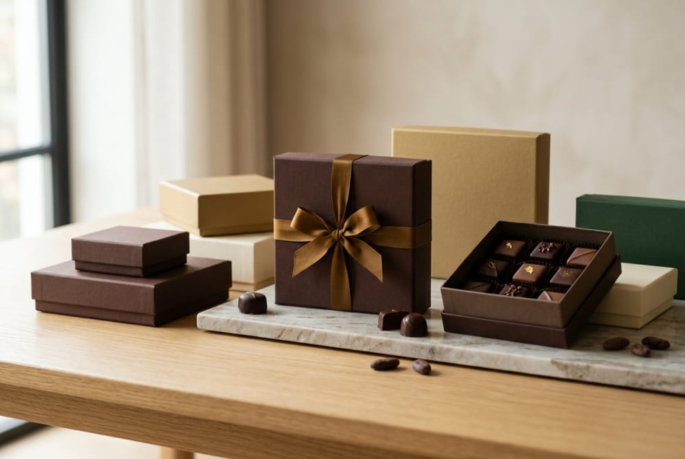
For boxed chocolates, shallow rigid boxes with lift-off lids remain one of the most effective premium formats in the United Kingdom. They open cleanly, present each piece in an orderly way, and work well for assortments sold in premium grocers or gift shops. Truffles benefit from tighter cavity control, often through paper pulp, card grid or thermoformed trays hidden beneath a paper wrap. This keeps cocoa-dusted or decorated surfaces intact during movement from production bench to customer table.
Biscuits and cookies often work better in deeper paper boxes or hinged-lid cartons, especially when the brand wants to suggest abundance. If the product has a handmade character, a folded carton with a printed interior can help convey warmth without overbuilding cost. For luxury shortbread, all-butter cookies or hand-iced seasonal biscuits, a two-piece box or magnetic closure gift format can justify a higher price point, especially for winter gifting and corporate hampers.
Holiday collections usually need more than a decorative print. They benefit from structural signals of occasion: layered openings, reveal panels, drawer boxes, ribbon pulls, or compartmented assortments that suggest curation. Advent-style concepts are particularly strong in the UK, where festive countdown packs perform well in supermarket premium tiers and among independent chocolate makers. Easter collections may favour brighter palettes and egg-protective cavities, while Valentine’s Day lines often perform best with compact gift proportions that feel personal rather than oversized.
Assorted confectionery ranges need careful hierarchy. The outer box should communicate whether the selection is chocolate-led, biscuit-led or mixed, and the internal presentation should make it obvious where each flavour or product type sits. This is one area where a gift packaging solution for premium sweets can outperform generic cartons. Structure, unboxing order and insert design all contribute to whether the assortment feels curated or merely combined.
| Product type | Recommended box style | Why it works | Best sales channel | Seasonal potential | Key caution |
|---|---|---|---|---|---|
| Handmade chocolates | Rigid lift-off lid box | Signals premium quality and protects finishes | Gift retail and online gifting | Very high at Christmas and Valentine’s | Avoid loose cavities |
| Dust-coated truffles | Compartment tray box | Reduces movement and surface damage | Boutiques and direct-to-consumer | High in autumn and winter | Need low-friction insert surface |
| Cookies and biscuits | Deep folding carton or hinged gift box | Supports stacked presentation and larger counts | Retail shelves and hampers | High for Christmas gifting | Watch crush resistance |
| Mixed assortments | Two-piece box with divider grid | Keeps product types separate and neat | Premium retail and corporate gifting | Strong year-round, peak in Q4 | Flavour map should be clear |
| Holiday collections | Drawer box or themed reveal box | Adds occasion value and gifting appeal | Seasonal campaigns and pop-ups | Very high in short promotional windows | Control overproduction |
| Mini tasting sets | Sleeved carton with insert | Cost-effective for short runs and launches | Sampling, events and online bundles | Useful for promotional editions | Keep branding concise |
The table above shows how format should follow product behaviour. A premium look alone is not enough; the structure must support transport, presentation and the intended sales channel. In UK conditions, where products may move through courier networks, shared retail storage and seasonal temperature shifts, matching structure to product type is essential.
The growth pattern shown above reflects a realistic market direction: higher demand for premium, gift-led confectionery packaging in the United Kingdom as more brands blend retail sales, direct-to-consumer fulfilment and limited-edition seasonal launches. By 2026, packaging decisions are likely to be shaped even more by recyclability expectations, automation compatibility and premium gifting demand.
How gift-ready box structures improve presentation and perceived value

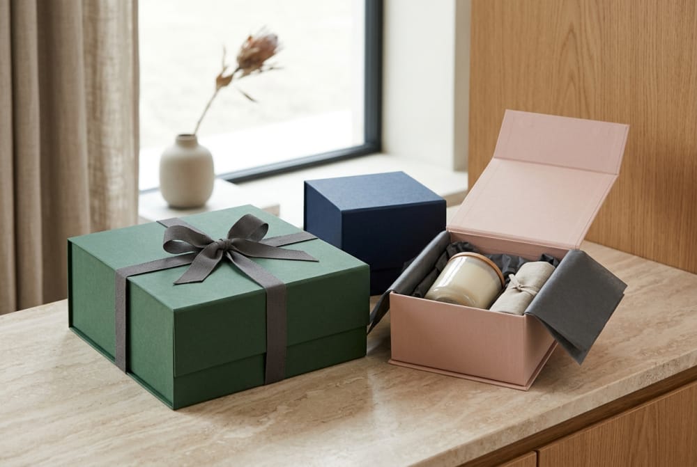
Gift-ready structure changes how customers judge a confectionery product before tasting it. Weight, closure, opening sequence and internal reveal all contribute to perceived quality. A thin carton with a loose tuck flap may be acceptable for everyday sweets, but it rarely creates the confidence expected for premium chocolates, truffle collections or festive biscuit assortments. By contrast, a firm two-piece box, book-style opening or well-fitted drawer structure suggests care, craftsmanship and price justification.
In the UK gift market, packaging often needs to do two jobs at once: look refined on a shelf and feel ready to hand over without further wrapping. That is why rigid boxes, magnetic closures, slipcase-and-tray designs and ribbon-pull drawer formats remain strong for confectionery. They create a sense of ceremony and reduce the need for secondary gift bags. In store environments from London’s West End to independent shops in Bristol or Glasgow, these formats help products stand out among flatter, more conventional cartons.
Presentation-led structure also improves merchandising. A box with a clean front panel, balanced depth and stable base photographs better for online listings and sits more confidently on a shelf or display table. For direct-to-consumer brands, this matters because the pack must perform in product photography, influencer gifting and customer unboxing content as well as in physical handling. An ordinary fold-top carton can do the job, but a thoughtfully designed gift structure usually creates a stronger emotional response.
Perceived value is not only about luxury cues. It is also about coherence. If a premium confectionery brand uses high-quality ingredients, careful flavour development and elegant visual identity, the packaging should support that story. A good structure makes the customer feel the price is justified. It signals that the maker has considered freshness, safe transit and display order, not simply outer appearance.
| Box structure | Presentation effect | Perceived value impact | Typical use | Cost position | Recommended for |
|---|---|---|---|---|---|
| Rigid lift-off lid | Classic premium reveal | High | Chocolate assortments | Medium to high | Luxury gifting |
| Drawer box | Layered unboxing experience | High | Truffles and tasting sets | Medium to high | Seasonal launches |
| Magnetic closure box | Strong gift presentation | Very high | Corporate gift confectionery | High | Executive gifting |
| Folding carton with sleeve | Balanced premium and efficiency | Medium | Cookies and mixed sweets | Medium | Short-run seasonal lines |
| Book-style box | Elegant story-led opening | High | Limited editions | High | Brand storytelling ranges |
| Simple tuck-end carton | Basic retail presentation | Low to medium | Everyday sweets | Low | Value-led lines |
The table makes one point very clear: the right structure changes more than appearance. It influences positioning, customer confidence and the amount a buyer is willing to pay. A confectionery brand does not need the most expensive format for every line, but it does need a format that fits its promise.
Manufacturing capability matters here. Our production team supports both small-batch custom work and larger repeat manufacturing, allowing brands to develop gift-ready structures without treating every seasonal project as a completely separate supply chain. That flexibility is useful for confectioners testing a new winter range, expanding a successful truffle collection or moving from a simple carton to a more structured gift box.
Sticker uses for flavor maps, short runs, holiday drops, and promotional editions
Stickers are one of the most practical tools in confectionery packaging, especially when product lines change frequently. They allow a brand to keep a core box format in stock while adapting the message, flavour list or seasonal look in short runs. For UK confectionery businesses managing Easter eggs, Christmas assortments, limited chocolate ganaches or event-exclusive biscuit sets, labels can reduce waste and shorten lead times.
One of the most valuable uses is the flavour map. When a chocolate assortment contains multiple fillings, customers want clarity without cluttering the front of the box. A well-placed label on the underside, inside lid or back panel can list flavours, allergens, tasting notes and best-before information in a format that is easy to update. This is particularly useful for artisanal makers whose assortments vary by season or ingredient availability.
Stickers also support short-run marketing. A standard box can become a Valentine’s release, a Mother’s Day edition or a retailer-exclusive launch simply by changing a colour-coded label, seal or sleeve accent. This is far more economical than printing a fully separate box for each micro-season. It also suits collaborations with hotels, cafés, florists and event planners that need custom branding in modest volumes.
For promotional editions, labels can act as proof of exclusivity. Numbered batch stickers, tasting collection identifiers or event-date seals can make a small release feel deliberate and collectible. In busy markets such as Birmingham, Leeds and Liverpool, where independent food brands often compete for attention in pop-ups and weekend retail, this can add urgency without increasing structural complexity.
Brands that need reliable label quality often look for print consistency, adhesive suitability and clean finishing. Our service capability includes flexible support for both short-run customisation and larger-scale packaging programmes, helping confectionery brands coordinate boxes and labels so the end result feels integrated rather than improvised. For businesses exploring multi-SKU flexibility, printed packaging stickers for seasonal sweet ranges can be an efficient tool.
| Sticker use | Main purpose | Best location | Ideal for | Operational benefit | Brand benefit |
|---|---|---|---|---|---|
| Flavour map label | Identify each sweet clearly | Inside lid or base | Chocolate assortments | Easy updates | Improves customer confidence |
| Seasonal front seal | Add festive identity | Top panel | Holiday gift boxes | Short-run adaptability | Makes standard packs timely |
| Promotional edition badge | Mark exclusivity | Front corner | Launches and events | Low setup cost | Creates urgency |
| Retailer collaboration label | Co-brand products | Sleeve or side panel | Private label or joint promos | Fast versioning | Supports partnerships |
| Batch or date sticker | Track short-run production | Back panel | Fresh confectionery | Operational clarity | Signals freshness |
| Gift message seal | Add gifting utility | Closure point | Direct-to-consumer orders | Simple fulfilment add-on | Enhances gifting experience |
The practical advantage of stickers is that they bridge the gap between custom appearance and inventory control. Instead of carrying many full-box variants, a brand can hold fewer base structures and customise late in the process. That is especially useful in the UK, where seasonal demand can change quickly with retail uptake, weather shifts and promotional timing.
Retail shelf packaging compared with direct-shipping packaging for fragile sweets
Retail shelf packs and direct-shipping packs often look similar from the outside, but they perform very different jobs. A shelf-facing confectionery box is designed primarily to attract attention, communicate flavour and fit merchandising constraints. A shipping-ready pack must survive courier handling, variable stacking pressure and longer movement from fulfilment centre to doorstep. Fragile sweets, especially hand-decorated chocolates and crumb-sensitive biscuits, expose the difference immediately.
For retail, clean fronts, efficient facings and neat depth ratios matter most. The pack should stand well, stack well and look appealing in chill-free bakery zones, food halls or seasonal display towers. In shops across the United Kingdom, pack formats also need to fit standard shelf footprints and secondary merchandising trays. Window panels can work well here, especially for biscuits and decorated confectionery, provided they do not weaken the structure excessively.
For direct shipping, compression strength, void control and internal restraint become more important. A beautiful rigid box can still fail if the sweets slide inside or the outer shipper does not absorb impact. Fragile confectionery usually needs a layered system: the primary gift box, a protective insert, and an outer transit carton sized correctly to prevent movement. Temperature considerations are also relevant during warmer months, particularly for chocolate shipments through southern distribution routes and last-mile delivery networks around London and the South East.
Many brands now need dual-purpose packaging. They sell through retail partners while also fulfilling online gift orders. In that case, it is wise to develop a gift box that looks shelf-ready but can nest efficiently inside a shipping carton. Choosing the right custom confectionery box structure can reduce duplicate packaging systems and simplify ordering.
The chart above reflects likely demand concentration: holiday collections and chocolate gift boxes lead premium packaging demand, while corporate gifting remains a valuable specialist segment. This is why many UK confectionery businesses prioritise box systems that can adapt between consumer gifting and business gifting without redesigning everything from scratch.
| Packaging factor | Retail shelf priority | Direct-shipping priority | Best practice | Risk if ignored | Suitable products |
|---|---|---|---|---|---|
| Front-face design | Very high | Medium | Keep branding bold and clear | Poor shelf pickup | All retail sweets |
| Compression strength | Medium | Very high | Use stronger board and outer cartons | Crushed contents | Biscuits and mixed sets |
| Internal restraint | High | Very high | Add fitted inserts | Movement damage | Chocolates and truffles |
| Window display | High | Low to medium | Use only if structure stays strong | Weak pack walls | Cookies and decorated sweets |
| Outer transit compatibility | Low | Very high | Design primary box to fit shipper sizes | Higher fulfilment cost | Online gifting ranges |
| Unboxing experience | Medium | High | Balance reveal with protection | Gift impact is lost | Premium e-commerce gifts |
For brands shipping from hubs such as Birmingham, Manchester or near the Port of Felixstowe supply corridor, transit consistency is a major consideration. Courier networks can be efficient, but confectionery remains vulnerable to shock, heat and mishandling. The best solution is rarely a single heavy box; it is a coordinated packaging system where each layer performs a clear function.
Insert and compartment layouts that keep confectionery products neat and appealing
Internal organisation is where premium confectionery packaging either succeeds or fails. A beautifully printed box loses its effect if chocolates tip over, truffles rub against one another or biscuits arrive with broken edges. Inserts and dividers solve this, but only when they are designed around product size, finish, count and packing method.
For chocolates, cavity trays are often the most visually reliable solution. They preserve spacing and create a jewel-box effect when the lid lifts. For more artisanal brands, card dividers can soften the look and feel less industrial than plastic-form trays. For cookies and biscuits, layered paperboard channels or protective wraps can prevent edge damage while preserving a sense of abundance. Mixed assortments often benefit from a grid system with clear category zones, helping customers understand the range at a glance.
Insert design should also consider packing efficiency. If cavities are too tight, line staff slow down and product surfaces may mark during loading. If too loose, movement damages presentation. This balance is easier to achieve when the packaging partner has strong technical capability and accurate die-cutting control. Our technological capability includes precise production processes that support consistent fit across boxes, trays and labels, helping confectionery brands maintain a polished result across repeated runs.
Compartment layouts can also guide storytelling. A tasting box may progress from milk to dark, from classic to adventurous flavours, or from lighter textures to richer fillings. In premium gifting, the arrangement becomes part of the experience. Customers read order and symmetry as signs of quality.
| Insert type | Visual effect | Protection level | Best for | Material options | Note |
|---|---|---|---|---|---|
| Thermoformed cavity tray | Very tidy and precise | High | Boxed chocolates | Food-safe formed insert | Good for uniform sizes |
| Card grid divider | Craft-led and premium | Medium to high | Truffles and mixed assortments | Board or paper card | Strong visual warmth |
| Paper nest insert | Soft artisanal presentation | Medium | Handmade sweets | Tissue or formed paper | Best for local boutique brands |
| Layered biscuit channels | Orderly stacked look | High | Cookies and shortbread | Board partitions | Reduces edge breakage |
| Removable tasting tray | Interactive presentation | Medium | Sampling sets | Board with pull tab | Good for promotional kits |
| Hybrid insert system | Balanced premium and practical | High | Mixed gift boxes | Board plus formed tray | Works well for dual-product ranges |
This comparison shows why inserts should never be treated as an afterthought. They influence visual order, transit safety, filling speed and the perceived care behind the product. A premium confectionery box is not simply a printed shell; it is a complete presentation system.
Surface finishes that work especially well for premium confectionery brands
Surface finishing helps confectionery packaging move from acceptable to memorable. The best finishes do not just add shine; they reinforce the flavour mood, price position and brand personality. In the UK premium sweets sector, the strongest results often come from selective restraint rather than too many effects at once.
Soft-touch lamination is popular for chocolate boxes because it adds a velvety feel that suits indulgent products. Spot UV can highlight a logo, cocoa illustration or festive pattern without overwhelming the pack. Foil stamping, when used carefully, remains highly effective for truffles, limited-edition assortments and Christmas gift lines. Gold, copper, rose gold and muted silver often outperform brighter metallics because they feel more refined under shop lighting.
Embossing and debossing are particularly strong on rigid gift boxes. They add depth and help a brand look established rather than generic. Textured papers can also work well for biscuit tins and confectionery cartons that want a more heritage-led feel. However, finishes should suit the brand story. A playful handmade marshmallow brand may need bright matte stocks and cheerful print cues rather than heavy foiling.
By 2026, sustainability expectations in the UK will continue influencing finishing choices. Brands will increasingly look for recyclable-friendly constructions, lower-plastic specifications and efficient decoration methods that still look premium. Policy pressure, retailer sustainability targets and customer scrutiny are all pushing the market in this direction. Premium no longer means excessive material use; it means intelligent material use.
The upward trend here reflects a broader market shift: buyers still want premium appearance, but they increasingly expect responsible packaging choices as part of that premium promise. This is especially relevant for retailers in cities such as Brighton, Cambridge and London, where consumer attention to sustainable packaging tends to be high.
| Finish | Look and feel | Best suited to | Premium effect | Sustainability consideration | Common mistake |
|---|---|---|---|---|---|
| Soft-touch lamination | Velvety and refined | Chocolate gift boxes | High | Check recyclability pathway | Using it on very low-cost board |
| Foil stamping | Luxurious highlight | Truffles and festive editions | High | Use selectively | Over-foiling every surface |
| Spot UV | Gloss contrast on matte base | Logos and patterns | Medium to high | Best in targeted areas | Applying it too broadly |
| Embossing | Tactile brand depth | Rigid boxes | High | Material thickness matters | Poor registration |
| Textured paper wrap | Heritage and craft feel | Biscuits and artisanal sweets | Medium to high | Often paper-friendly | Choosing texture that hides print |
| Matte coating | Calm, modern appearance | Minimal brands | Medium | Usually efficient | Too plain without contrast |
Good finishing turns tactile contact into brand reinforcement. The customer notices it when lifting the lid, holding the box for gifting or storing it after opening. That prolonged interaction is one reason premium confectionery packaging can leave a lasting impression well beyond the purchase moment.
Design choices that make confectionery packaging feel too ordinary
Many confectionery packs fail not because they are incorrect, but because they look interchangeable. Ordinary packaging tends to rely on predictable cues: generic script fonts, excessive brown-and-gold combinations, stock imagery of melted chocolate, cluttered flavour descriptions, or standard carton shapes with no real structural interest. When every brand uses the same shorthand for indulgence, none of them feel distinctive.
Another common problem is mismatch between brand and pack. A handcrafted small-batch chocolatier using supermarket-style graphics may undermine its own value. Conversely, a mass-market biscuit line dressed in overdone luxury cues can feel inauthentic. Premium effect comes from consistency, not just expense. If the brand is modern and playful, the packaging should express that through typography, colour blocking, shape or illustration.
Overcrowding is especially damaging. Too much front-panel text, too many badges, and too many finishing effects can make a confectionery pack feel nervous rather than premium. Customers buying a gift want reassurance, not visual noise. Clear hierarchy matters: what it is, why it is special, how many pieces are inside, and any seasonal or flavour guidance.
Ordinary packaging also ignores internal experience. If the exterior is attractive but the inside is empty-looking, untidy or difficult to navigate, the premium promise weakens immediately. This is why insert design, flavour mapping and opening sequence deserve as much design attention as the front panel artwork.
To stand out in the United Kingdom market, brands should study context. What appears distinctive in a London food hall may differ from what works in a Cotswolds farm shop or a Leeds department store. Packaging should respond to channel and audience rather than copying broad category trends.
How to plan seasonal packaging without overextending inventory commitments
Seasonal packaging can drive excellent sales, but it can also trap a brand in leftover stock, mismatched components and poor cash flow. This is a common challenge for confectionery businesses because sales spikes are concentrated around short windows. Christmas may justify a major gift push, but forecasts can still shift late. Easter ranges can move quickly or stall depending on weather, promotions and retailer timing. The answer is to build seasonal packaging in layers.
Start with a core structural platform. This might be a rigid base box, a standard carton size or a reliable insert format that works across several product versions. Then add seasonal differentiation through sleeves, stickers, ribbons, inserts or limited-run outer wraps. This allows the brand to preserve premium appearance without locking itself into large stocks of highly specific printed boxes.
Forecasting should be tied to channel mix. Retail orders, online pre-orders, corporate gifting enquiries and repeat seasonal accounts all give useful signals. Confectionery brands in the UK often benefit from staging production around confirmed demand bands rather than printing every variation in one go. Ports and logistics hubs such as Southampton, Felixstowe and Liverpool remind us that timing, storage and supply flexibility matter just as much as design when planning seasonal inventory.
Our manufacturing capability is built for this kind of flexibility. Because we support both small-batch customisation and larger volume production, confectionery brands can scale packaging according to real seasonal demand instead of committing too early to one fixed scenario. That is especially useful for holiday drops, retailer trials and region-specific gift campaigns.
Service capability matters as well. A responsive packaging partner helps brands align materials, finishing, labels and delivery timing with campaign windows. This reduces the risk of holding obsolete stock after a holiday has passed. For brands building a modular seasonal programme, exploring custom box options for seasonal confectionery lines can create a more manageable long-term system than designing each festive range from zero.
This comparison underlines what many confectionery buyers already know: speed and flexibility are nearly as important as appearance. Seasonal selling windows are short, so packaging systems must support fast adaptation without compromising fit or finish.
| Planning method | How it works | Inventory risk | Cost control | Best for | Comment |
|---|---|---|---|---|---|
| Fully unique holiday box per season | Separate print and structure for each campaign | High | Low | Major national promotions | Strong impact, less flexible |
| Core box plus seasonal sleeve | Reuse base pack with outer wrap change | Medium to low | Good | Christmas and Easter ranges | Balanced option |
| Core box plus stickers | Late-stage versioning through labels | Low | Very good | Short runs and test launches | Fast and practical |
| Modular insert system | Same box with product-specific tray swaps | Medium | Good | Assorted confectionery | Helps SKU expansion |
| Pre-order-led packaging schedule | Production tied to confirmed demand | Low | Strong | Direct-to-consumer gifting | Needs accurate timing |
| Retailer-exclusive add-on branding | Shared pack with selective custom elements | Low to medium | Good | Wholesale partnerships | Supports collaboration sales |
The table shows why modular thinking works so well. It preserves gift appeal while protecting cash flow and storage space. For many UK confectionery businesses, especially independent makers and fast-growing premium brands, that balance is more valuable than a completely unique holiday box for every event.
FAQ
What is the best packaging style for premium chocolate gifts in the UK?
A rigid lift-off lid box with a neat insert is often the strongest choice. It looks gift-ready, protects fragile pieces and supports a higher perceived value.
Are stickers suitable for luxury confectionery packaging?
Yes, when used carefully. They are especially effective for flavour maps, seasonal editions, limited runs and retailer-specific versions. The key is to integrate them cleanly into the overall design.
How can a confectionery brand balance retail and e-commerce packaging?
Use a gift box that presents well on shelf but is sized to fit an efficient outer transit carton. Add inserts that control movement during shipping.
Which finishes work best for truffles and festive assortments?
Soft-touch lamination, restrained foil stamping, embossing and textured wraps tend to work particularly well, depending on brand style and sustainability goals.
What makes confectionery packaging look too generic?
Overused visuals, weak structure, poor insert design, cluttered text hierarchy and finishing choices that do not match the brand all contribute to an ordinary feel.
How should brands prepare for 2026 packaging trends?
Focus on recyclable-friendly designs, modular seasonal systems, digital flexibility for short runs, and packaging that supports both premium gifting and operational efficiency.
For confectionery brands serving the United Kingdom, premium packaging works best when it combines structure, protection, visual identity and planning discipline. The most successful boxes for chocolates, cookies, truffles and holiday collections are not simply decorative. They are engineered to present the product properly, travel safely, adapt to seasonal demand and make the buyer feel they are giving or receiving something special.
That is where the right packaging partner adds value. Technical capability supports precise production, manufacturing flexibility allows both small-batch and larger-scale supply, and responsive service helps brands manage seasonal timing with less risk. When those strengths come together, confectionery packaging becomes more than a container. It becomes part of the product experience itself.