Packaging systems that help supplement brands look credible and stay organised
For supplement brands in the United Kingdom, outer packaging is not just a carton around a bottle or sachet. It is part compliance tool, part retail signal, part logistics unit and part brand framework. When the structure is right, packaging helps teams manage label changes, support wholesale distribution, keep line extensions coherent and present products in a way that feels credible from London shelves to fulfilment hubs near Birmingham and Manchester. When the structure is weak, even a good formula can look inconsistent, rushed or difficult to trust.
The most effective approach is to treat cartons, sleeves, inserts and stickers as one connected system. That system should work across capsules, gummies, powders, sachets and multi-SKU kits without forcing a redesign every time a product changes flavour, dosage or pack count. For brands selling through health shops, gyms, pharmacy-adjacent retailers, Amazon prep centres and trade partners across the United Kingdom, this matters as much as colour and typography.
In practice, supplement packaging performs best when it answers four questions at once: does it fit the product safely, does it preserve enough room for legal and technical information, does it help the item stand out on shelf, and can it scale economically as the line grows? Brands that solve these four points early usually spend less on reworks and gain better consistency across print runs.
Our workshop supports this with advanced converting and finishing equipment, careful material control and inspection-led production, allowing both short custom runs and larger scale orders for folding cartons, paper boxes, labels and sticker applications. That flexibility is especially useful for UK supplement businesses moving between test launches, private-label projects and wider retail distribution.
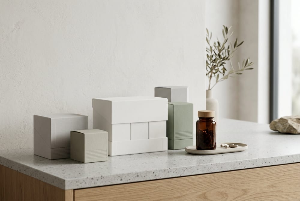
Outer packaging needs for capsules, gummies, powders, sachets and bundled kits

Different supplement formats create different outer packaging pressures. Capsules often need cartons that support bottle presentation while leaving enough panel space for ingredients, directions, warnings, batch coding areas and retailer-facing information. Gummies usually need outer packs that communicate flavour and softness without drifting into a confectionery look that feels childish or undermines health positioning. Powders frequently require stronger visual hierarchy because the front panel must quickly explain function, serving size and flavour while the side or rear panels carry more technical detail.
Sachets introduce another layer. A single sachet may not have enough surface area for all messaging needs, so brands often use outer cartons to organise multipacks, explain usage and create room for compliant presentation. This is common for hydration powders, collagen sticks and greens blends sold in travel-friendly formats. Bundled kits, such as starter stacks or month-one programmes, need even more structural thought because they combine several products with inserts, trays or dividers and often move through both direct-to-consumer and wholesale channels.
UK brands also need to think about where the product will physically sit. A supplement box designed only for studio photography may fail in a busy retail environment in Leeds, Bristol or Glasgow, where shoppers scan shelves quickly and buyers check case dimensions for stockroom efficiency. In contrast, a well-planned carton supports brand presence, internal stability and easier picking.
| Product format | Typical primary pack | Outer packaging need | Main compliance pressure | Retail risk | Recommended solution |
|---|---|---|---|---|---|
| Capsules | HDPE or PET bottle | Carton for shelf presence and added panel space | High text density | Looks too clinical or too generic | Structured carton with clear front hierarchy |
| Gummies | Jar or pouch | Protective carton or branded sleeve | Age and usage clarity | Looks like sweets | Use mature health cues and dosage emphasis |
| Powders | Tub or pouch | Outer box for premium positioning or gift packs | Serving and flavour detail | Visual clutter | Large panels with strict information zoning |
| Sachets | Single sticks | Multipack carton with count visibility | Small-format data overflow | Weak organisation | Carton with insert and batch control area |
| Softgels | Bottle or blister | Carton for category differentiation | Storage and allergen statements | Minimal distinction from capsules | Colour-coded family design |
| Bundled kits | Mixed components | Rigid or folding box with dividers | Multi-item identification | Damage in transit | Tray-based layout with insert cards |
The table shows why one packaging template rarely fits every supplement format. The more a brand mixes formats, the more useful it becomes to build a modular system. This often means shared brand cues across the full range but different box depths, inserts and information zoning according to the product type.
For brands exploring custom cartons, a practical starting point is a scalable pack family rather than a single one-off design. A well-built custom supplement box solution can be adjusted for bottle height, sachet count or kit composition while keeping the same visual framework and production logic.
How box design can improve shelf impact without complicating compliance panels

Good shelf impact is not about filling every surface with claims, icons or metallic effects. In the UK supplement market, where products may appear beside sports nutrition, wellness formulas and pharmacy-style lines, trust often comes from restraint and clarity. Box design works best when the front panel does one job well: identify the product, communicate its use, and establish brand confidence within two to three seconds.
Compliance information should not compete with that moment. Instead, the design should allocate clear zones. The front can carry product name, format, count and a restrained benefit statement. One side can manage ingredients and directions. Another side can hold warnings, batch placement and contact details. The rear panel can tell the fuller product story. This reduces crowding and helps proofing teams review changes efficiently.
Typography, colour coding and white space often do more for shelf impact than decorative complexity. A magnesium capsule, a collagen gummy and a greens powder can feel part of the same line without looking repetitive if the hierarchy remains stable and only the category code, colour band or product illustration changes. This helps on physical shelves and in online product grids alike.
Retailers in places such as London, Birmingham and Edinburgh also care about practical presentation. Boxes that stand cleanly, avoid overhang on shelf lips and display barcodes in predictable locations create fewer operational problems. Better packaging design therefore supports both customer perception and store handling.
| Design element | Effect on shelf impact | Effect on compliance | Common mistake | Better approach | Why it works |
|---|---|---|---|---|---|
| Large product name | Improves fast recognition | Neutral | Too many competing headings | Single dominant title | Reduces scanning friction |
| Colour bands | Supports line differentiation | Neutral | Different colour logic per SKU | Fixed category colour system | Keeps the range coherent |
| Front-panel claims | Can attract attention | High risk if excessive | Overloaded wording | Limit to one core message | Preserves clarity and trust |
| Icons and badges | Adds cues quickly | Can create clutter | Too many small symbols | Use only priority icons | Improves readability |
| Foil and gloss | Boosts premium feel | Neutral | Using effects everywhere | Apply selectively | Creates focus, not noise |
| Panel zoning | Indirect shelf benefit | Strongly positive | No clear content structure | Assign fixed data areas | Speeds reviews and revisions |
The table highlights a simple truth: shelf appeal and compliance are not enemies if the layout is planned early. The problem usually appears when branding is created first and statutory or technical content is pushed into leftover space later.
The line chart reflects a realistic upward pattern in packaging demand linked to health retail growth, subscription sales and broader product segmentation. As the market expands through 2026, brands that standardise carton architecture early are usually better placed to add new formulas without disturbing the full range.
Sticker solutions for small batches, formula changes and private-label production
Sticker strategies are essential for supplement businesses that need speed or flexibility. In the United Kingdom, small-batch launches often begin with a stable primary bottle or pouch and a variable printed label or carton sticker. This is particularly useful for pilot runs, seasonal flavours, test channels and clinical-practitioner lines where formulas or claims may change before the range settles.
Stickers also make sense in private-label production. A contract-packed supplement may share the same structural packaging as other projects but require different branding, dosage statements or language variants. Instead of replacing a whole printed box stockholding, a brand can use carefully specified stickers for selected panels, promotional overlays or controlled information updates. The key is to do this cleanly, not as an afterthought.
High-quality sticker application can preserve a premium look when materials, adhesive choice and finish are considered properly. Misaligned labels, edge lift, poor opacity or inconsistent colour matching quickly damage trust. In categories built around health, consistency matters more than novelty.
Our production setup supports both precision label work and matching printed packaging, which helps clients manage short runs, formula revisions and multi-brand programmes without losing visual discipline. That service flexibility is valuable for start-ups testing one hero SKU and for more established businesses adding distributor-exclusive variants.
Brands needing agile updates can combine cartons with supplement packaging sticker solutions to handle limited editions, private-label overlays or regulatory text changes while maintaining the core look of the pack.
| Use case | Why stickers help | Best surface | Main quality concern | Suitable run size | Recommended finish |
|---|---|---|---|---|---|
| Small-batch launch | Avoids high carton inventory | Bottle and sleeve | Colour consistency | Very low to medium | Matt with strong adhesive |
| Formula update | Fast content adjustment | Carton side panel | Legibility over print | Low to medium | Opaque white stock |
| Private-label run | Enables brand variation | Jar, pouch, outer box | Premium appearance | Low to high | Soft-touch or matt laminate label |
| Seasonal variant | Short-term marketing change | Front flash or neck label | Temporary look becoming messy | Low | Removable or promotional stock |
| Retailer-exclusive SKU | Fast differentiation | Outer carton | Barcode placement | Medium | Scuff-resistant label |
| Compliance correction | Short-term mitigation | Specific panel area | Patchwork appearance | Emergency only | Exact-size cover label |
The explanation behind this table is simple: stickers solve operational problems well when they are planned into the packaging system, but they can undermine credibility when used repeatedly as visible corrections. A strong strategy sets rules for when stickers are part of the design and when a full print revision is the better decision.
Packaging differences between single-product launches and growing supplement lines
A single-product launch is usually focused on speed, budget control and immediate recognisability. The goal is to make one SKU look trustworthy enough to win attention online or in-store. The packaging can be narrow in scope, using one bottle size, one carton depth and a simple information hierarchy.
As soon as the line begins to grow, the priorities shift. A range with four, eight or fifteen SKUs needs a logic that can scale. This includes naming structure, panel hierarchy, barcode placement, colour architecture, pack dimensions, outer case planning and stock-keeping discipline. What looked efficient for one product may become expensive or confusing for a broader line.
For example, a brand launching collagen in one flavour may use a highly customised front panel. If the same brand later adds vitamin gummies, mineral capsules, hydration sachets and sleep support bundles, a more controlled visual system becomes necessary. Otherwise, each addition feels like a separate brand. Buyers and consumers then struggle to understand the portfolio.
Growing supplement lines in the UK also face channel expansion. The pack that works on a Shopify site may not suit a shelf in a wellness retailer in Bath or a wholesale order headed through distribution routes near Felixstowe. Larger lines therefore need stronger data control, better carton standardisation and clearer case-pack logic.
| Packaging factor | Single-product launch | Growing line | Main risk if ignored | Scalable recommendation | Business effect |
|---|---|---|---|---|---|
| Brand hierarchy | Simple | Must be systematic | SKU confusion | Fixed title architecture | Better range recognition |
| Carton size strategy | One-off | Needs grouped standards | Rising tooling complexity | Use modular dimensions | Lower production friction |
| Colour use | Flexible | Must follow rules | Weak family appearance | Assign category colours | Cleaner merchandising |
| Label updates | Occasional | More frequent | Version control errors | Central artwork matrix | Faster change management |
| Case-pack planning | Basic | Essential | Wholesale inefficiency | Align packs to distribution needs | Improved trade handling |
| Product extensions | Not urgent | Ongoing | Design drift | Create extension templates | Easier future rollout |
This comparison shows why packaging should be planned as a growth framework rather than a one-time artwork exercise. Brands that think ahead at launch often find it much easier to add line extensions, promotional bundles and retailer-specific formats later.
Case-pack and distribution details that matter in wholesale supplement sales
Wholesale performance depends on more than the retail unit. Case-pack structure, transit protection, barcode visibility and pallet efficiency all influence whether a supplement line is easy to stock, ship and replenish. UK wholesalers and trade buyers expect packaging that works through warehousing, courier handling and store allocation without generating avoidable breakage or confusion.
Case dimensions should reflect product weight and reorder patterns. Overfilled cases can split, while under-filled cases waste freight and storage. Supplement products shipped through hubs around Birmingham, the M1 corridor, Liverpool and Southampton benefit from practical standardisation because they often move through mixed-channel distribution, from e-commerce fulfilment to retail replenishment.
It is also useful to decide early whether cartons are shelf-ready, ship-ready or both. Some products sold into independent health shops may need display-friendly outers. Others, especially subscription-led products, only need secure transit cases. Confusing these two needs can increase cost without improving performance.
Our manufacturing team works across short and larger production volumes with careful checks from material selection through final inspection, which helps clients align retail packaging with transit and case-pack requirements rather than treating shipping as a separate afterthought.
| Distribution detail | Why it matters | Common mistake | Trade consequence | Recommended practice | UK relevance |
|---|---|---|---|---|---|
| Units per case | Affects ordering efficiency | Arbitrary counts | Buyer frustration | Match MOQ and replenishment logic | Useful for mixed retail accounts |
| Case strength | Protects product in transit | Using light board for heavy tubs | Damage claims | Board grade by product weight | Important for long courier routes |
| Inner dividers | Stops movement | No separation for glass or kits | Scuffs and breakages | Fitments or partitions | Supports premium bundled sets |
| Barcode placement | Speeds receiving | Hidden or inconsistent location | Scanning delays | Standardise on case faces | Useful in warehouse operations |
| Pallet pattern | Improves freight use | Odd case footprints | Instability | Design to pallet logic | Relevant for port and RDC flows |
| Tamper evidence | Builds confidence | Weak seals or none | Trust loss | Use integrated security cues | Valued by retailers and consumers |
The explanation here is that wholesale success depends on the invisible performance of packaging as much as the visible front panel. A carton that photographs well but arrives crushed at a trade customer in Newcastle does not support the brand. Distribution-aware design protects both margins and reputation.
The bar chart suggests where packaging volume and complexity are likely to be concentrated in the near term. Daily wellness and sports nutrition continue to drive significant demand, but gut health, hydration and beauty supplements also create opportunities for differentiated carton and sachet systems.
Simple ways to keep line extensions consistent across multiple SKUs
Consistency is one of the strongest trust signals in supplement packaging. It tells the buyer that the business is organised and that the products belong to one controlled system. This does not mean every SKU should look identical. It means each SKU should clearly belong to the same family.
The easiest way to achieve this is by fixing several non-negotiable rules: one logo position, one product-name hierarchy, one typography set, one ingredients panel structure, one barcode zone and one method of distinguishing categories. The elements that can vary then become controlled variables, such as accent colour, ingredient illustration, flavour descriptor or format icon.
This is especially important when new products are added quickly. A line extension for iron capsules, a vegan protein powder, a sleep gummy and a travel sachet should not introduce entirely new design logic each time. If the framework is stable, new SKUs can be launched faster and artwork approvals become easier to manage.
For retailers and distributors, line consistency also improves visual blocking on shelves and in online listings. A shopper in a Manchester health shop or browsing on a mobile phone should instantly recognise the brand family, even when products serve different functions.
| System rule | Keep fixed | Allowed variation | Benefit | Risk if missing | Best for |
|---|---|---|---|---|---|
| Logo placement | Top-centre or top-left | Minor size adjustment | Strong recognition | Fragmented appearance | All lines |
| Product title format | Same hierarchy pattern | Different names and strengths | Readable portfolio | Confusing front panels | Capsules and powders |
| Category colour coding | Rule-based palette | Shade depth by flavour or strength | Easy SKU distinction | Random colour sprawl | Multi-SKU ranges |
| Information panel order | Same content sequence | Text length only | Faster proofing | Missed data errors | Compliance-heavy ranges |
| Pack dimension family | Grouped box footprints | Depth changes | Efficient case packing | Higher stock complexity | Wholesale lines |
| Finish strategy | Common material feel | Selective highlight effect | Premium unity | Uneven quality perception | Retail-facing brands |
This table explains how consistency is created through rules, not repetition. By fixing a small number of key structural and graphic decisions, a brand gains freedom to add new products without visual drift.
Packaging choices that can weaken trust even when the product is strong
Consumers and trade buyers often make fast assumptions from packaging signals. If the outer pack looks unstable, overclaimed, inconsistent or cheaply corrected, people may question the formula before they read the details. This is especially true in supplements because the product promise is closely tied to safety, routine and credibility.
One common issue is visual exaggeration. Too many bold claims, conflicting type styles or crowded panels can make the pack feel less reliable. Another is mismatch between price and packaging feel. A premium formula in a flimsy carton or with visibly skewed stickers creates doubt. Inconsistent colours between print runs have a similar effect, making products look old, copied or poorly controlled.
Structural weakness is another trust problem. If a kit opens awkwardly, a sachet carton crushes easily, or a bottle rattles excessively inside the box, the customer notices. Trust is shaped by touch as much as by graphics. Even simple choices such as board thickness, closure style and insert fit can influence whether the brand appears careful or careless.
Brands should also avoid copying visual codes that feel too close to confectionery, cosmetics or general FMCG if that weakens the health positioning. Gummies and flavoured powders are especially vulnerable to this. Attractive packaging is valuable, but it should still signal responsibility and control.
The area chart illustrates a realistic market shift toward packaging that balances premium presentation with operational clarity. Through 2026, more UK supplement brands are expected to favour clearer compliance zoning, recyclable substrates and stronger information architecture over purely decorative finishes.
How to create a supplement packaging framework that is easy to expand
An expandable packaging framework starts with decisions that are small enough to manage and strong enough to scale. The brand should set one master packaging architecture covering format families, dimensions, panel logic, naming rules, material standards and update procedures. This framework is what allows one product to become ten without each launch feeling like a separate project.
Begin with format clusters. For example, capsules and softgels may share one bottle-and-carton family, powders another, sachets a third and bundles a fourth. Then create dimension bands within each cluster instead of unique box sizes for every SKU. Next, define the information stack for all products so that legal and technical text always appears in the same order. Finally, build a visual codebook that assigns category colours, typography rules and finish use.
From there, operational controls matter. Keep artwork versioning centralised. Reserve fixed areas for batch coding and distributor marks. Standardise barcode locations. Decide in advance when a sticker is acceptable and when a full reprint is required. This prevents line extensions from creating chaos.
Our service capability is built around this kind of expansion planning. Clients can start with a short-run customised pack, then transition into broader production volumes while keeping the same quality expectations, material logic and finishing standards. That matters for growing UK brands supplying independent retailers, online channels and wholesale accounts at the same time.
This comparison chart shows the capabilities that matter most when choosing a packaging partner for a supplement range expected to expand. Short-run flexibility is useful at launch, but inspection discipline, structural adaptability and scale-up readiness become even more valuable over time.
Market perspective for the United Kingdom
The United Kingdom remains one of Europe’s most active supplement markets, supported by mature e-commerce adoption, broad interest in preventive health and a diverse retail base that includes health shops, grocery, pharmacy-adjacent channels, gyms and practitioner networks. London remains the strongest centre for brand development and marketing, while cities such as Manchester, Birmingham and Bristol continue to support fulfilment, distribution and specialist retail activity.
Ports and trade routes also influence packaging decisions. Goods moving through Felixstowe, Southampton or Liverpool may face multiple handling stages, making case strength and pallet logic more important than many emerging brands expect. At the same time, urban retail environments in places such as Brighton, Edinburgh and Leeds often reward compact packs that create strong shelf blocking without consuming excessive space.
By 2026, three trends are likely to shape packaging choices more strongly: greater demand for recyclable or reduced-material formats, tighter expectations around data clarity and traceability, and wider use of digital workflows to manage artwork changes across multiple SKUs. Brands that adopt a structured packaging system now will be better placed to respond.
Applications across industries and channels
Supplement packaging systems are no longer limited to traditional vitamin brands. Sports nutrition businesses need robust tubs, cartons and shipping-ready cases. Beauty-from-within brands often require refined, giftable packaging without losing technical credibility. Practitioner-led and wellness clinic lines need understated, information-rich packs. Corporate wellness bundles and promotional starter kits may need inserts, sleeves or onboarding cards.
Applications also vary by channel. Direct-to-consumer packs often prioritise unboxing, subscription repeatability and shipping durability. Retail packs need shelf visibility and neat case quantities. Marketplace-ready packs must photograph well and survive fulfilment handling. Trade show kits may require presentation-first structures that can still support later wholesale scaling.
Case examples of scalable packaging thinking
A small collagen brand launching in London may begin with one pouch and one carton-supported bundle for a two-month challenge pack. If the framework is planned properly, it can later add single-serve sachets for travel, a berry flavour extension and a wholesale case format for salon distribution without changing the brand architecture.
A sports supplement business in Manchester might start with one creatine powder tub and one capsule SKU. By using grouped carton dimensions, fixed colour coding and standardised barcode zones, it can then add hydration sticks and recovery gummies for gym chains while still looking like one disciplined range.
A practitioner-oriented line supplying clinics in Bristol and Edinburgh may value subtle, data-led packaging over bold retail styling. For this kind of brand, the expandable framework is less about dramatic shelf impact and more about precise information panels, controlled stickers for formula updates and reliable short-run replenishment.
Local supplier considerations
When selecting a packaging partner for the UK market, buyers should examine more than price. The supplier should understand supplement-specific information density, carton engineering, label accuracy, proofing discipline and the tension between launch flexibility and long-term consistency. It also helps if the supplier can support both lower-volume custom projects and larger repeat production without changing the quality level.
Technology matters here. Modern converting, print control and finishing equipment improve repeatability across cartons and stickers. Manufacturing capability matters too: material selection, production discipline and final inspection all influence whether packs remain consistent from trial batch to larger rollout. Service capability is equally important, especially for brands handling private-label projects, range expansions and artwork revisions under time pressure.
Our company approach
For supplement brands targeting the United Kingdom, our role is to help build packaging systems that are practical as well as attractive. On the technology side, we use advanced machinery and controlled finishing processes to support accurate box production, label work and repeatable quality across different formats. That helps brands maintain a stable presentation when they move from one SKU to a broader range.
On the manufacturing side, we pay close attention to detail from substrate choice to final inspection. This matters for supplement cartons, stickers and paper-based packaging where print clarity, structural fit and clean finishing all affect trust. Whether a client needs a short custom run for a launch or larger production for wider distribution, the manufacturing workflow is designed to stay efficient and quality-focused.
On the service side, flexibility is central. Some clients need small-batch packaging for market testing, some need label adjustments after formula changes, and some need coordinated packaging across private-label programmes. We support these different paths with responsive production planning that helps brands stay organised as they grow.
Buying advice for supplement brands
If you are choosing packaging for a new or expanding supplement line, start by mapping future SKUs before locking the first box. Even a rough plan for likely capsules, powders, sachets or kits can prevent expensive redesigns later. Next, identify which information must always remain visible and which messages are optional. This creates the basis for stable panel zoning.
Then ask practical questions: Will the product go to independent retail, e-commerce, wholesale or all three? Does it need room for sticker overlays in early runs? Will the same formula be sold under more than one brand? Can your case-pack quantities support both freight efficiency and retailer expectations? These are packaging questions, not just supply-chain questions.
Finally, build consistency into the brief itself. Specify material feel, finish level, colour logic, barcode rules and data placement before design starts. That makes the packaging easier to expand and easier to trust.
Frequently asked questions
What outer packaging works best for capsules in the UK supplement market?
A folding carton with clear front hierarchy and organised side panels usually works well because it supports shelf impact while creating room for technical information.
Are stickers suitable for premium supplements?
Yes, if they are specified properly and used strategically. For short runs, private-label projects or controlled formula updates, high-quality stickers can look professional and efficient.
How many box sizes should a growing line use?
As few as practical. Grouping SKUs into modular size families reduces complexity in artwork, stockholding, case packing and future extensions.
What weakens trust most in supplement packaging?
Common issues include cluttered claims, inconsistent printing, poor structural fit, visible correction labels and packaging that feels too flimsy for the product positioning.
What should brands prepare before requesting a packaging quotation?
Provide the product format, pack count, target channels, approximate run size, desired finish, whether sticker flexibility is needed and whether the range will expand soon.
What 2026 packaging trends should UK brands watch?
Expect stronger interest in recyclable materials, cleaner compliance-led layouts, digital artwork control, traceability support and packaging systems designed for rapid line extension.