
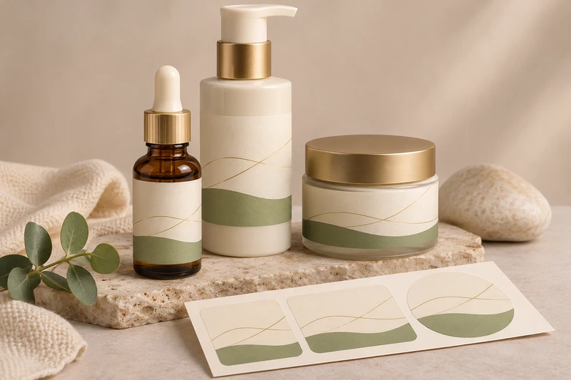
Cosmetic labels create a recognisable skincare range when the same brand system must work on narrow serum bottles, pump packs and wider cream jars. The key is not to force one label layout onto every container, but to keep the information hierarchy, variant cues and visual character consistent while adapting the artwork to each usable panel.
For skincare buyers in the United Kingdom, this matters across retail shelves, online orders, starter kits and gift sets. A serum and moisturiser should look related when displayed together, yet remain easy to identify when a customer is choosing between formulations. XGolden Print designs and produces custom labels and stickers for bottles, jars, boxes and bags, supporting label dimensions, shapes, artwork and agreed roll or sheet formats for the individual project.
One skincare range across different containers
A coordinated skincare label range starts with a shared system rather than identical labels. The brand name, product family, typeface approach, colour palette and key product information can remain consistent across containers. Each label then needs to respond to the physical format it will be applied to.
A serum bottle may provide a narrow front-facing panel, while a cream jar can offer a shorter but broader label area. Pump bottles, droppers and jars also have different visual centres because closures, shoulders and bases change where the eye naturally lands. A design that looks balanced on a flat artwork file may become crowded, too small or visually off-centre once wrapped around a container.
Build the range around a few non-negotiable elements:
- Brand identifier: place the brand name in a consistent, immediately recognisable position.
- Product type: make “serum”, “cream”, “cleanser” or another approved product name easy to locate.
- Variant marker: use a consistent colour, symbol, name position or secondary visual cue for each formulation.
- Size and supporting copy: reserve a suitable area for brand-approved copy without competing with the product name.
- Shared design language: repeat selected graphic elements, spacing principles and typography without requiring the same proportions on every pack.
The result should help customers see that the products belong together while letting staff, retailers and consumers distinguish them quickly. This is especially useful where several skincare products sit in one retail bay or are presented as a routine within a gift set.
Labels are applied to the primary container rather than replacing it. They support presentation and product identification, but they are not a complete transport-protection system. If skincare products are being sold online or packed as a gift, the outer carton, box or mailing arrangement should be considered separately.
| Skincare application | Main label requirement | Layout approach to consider | Points to confirm |
|---|---|---|---|
| Serum bottle | Clear front-facing identification on a narrow panel | Prioritise brand, product type and variant on the visible face | Bottle diameter, shoulder shape, closure position and usable label height |
| Pump bottle | Readable information around the dispensing format | Leave visual space around the pump and keep key copy forward-facing | Container circumference, pump orientation and application method |
| Cream jar | Strong shelf visibility across a wider, shorter area | Use horizontal hierarchy and avoid overfilling the label | Jar diameter, sidewall height, lid branding and placement |
| Skincare gift set | Easy product recognition when items are grouped | Keep variant cues consistent across every item in the set | Box layout, insert arrangement and how labels appear through any opening |
| Online skincare order | Labels that remain legible after normal fulfilment handling | Use uncluttered hierarchy and review the actual filled container | Handling conditions, outer packaging and delivery destination |
Fitting the layout to a serum bottle and cream jar
The usable label panel is more important than the container’s nominal dimensions. Before setting artwork, identify the flat or gently curved space that is appropriate for the label. Measure the area between shoulders, seams, bases, ridges, moulded details and closures. A label that crosses a sharp contour or sits too close to a taper can be difficult to apply consistently or may look uneven.
Serum bottles: focus the front panel
Skincare serum bottles often call for a compact, vertical label composition. The front panel should communicate the essentials at a glance: brand, product name and variant or range name. Supporting brand-approved copy can sit beneath or around these elements where the available space allows.
Avoid designing solely to the widest point of the bottle if the shape narrows towards the shoulder or base. On a cylindrical bottle, the visible front is only part of the circumference. Copy that reaches too far around either side may be less useful when the product is standing in a retail display or photographed for an e-commerce product page.
A practical serum bottle label brief should state:
- The full bottle height and diameter.
- The preferred label position from the base and closure.
- The usable label height and maximum wrap width.
- Whether the bottle is cylindrical, tapered, faceted or otherwise shaped.
- Whether a front label, back label or wraparound approach is required.
- Whether labels will be applied by hand or within a planned packing workflow.
The LS-301 serum-bottle label example is a useful reference point for considering label presentation on a serum bottle. The final label specification should be developed around the actual container dimensions, artwork and use conditions. The product name alone does not establish a material, adhesive or resistance level.
Cream jars: use width without losing order
Cream jars often allow a wider horizontal layout, but the sidewall may be shallow. This can make small text difficult to read if too much information is placed in a single line. A jar label benefits from a clear front-facing block, with the product name and variant taking priority over decorative graphics.
Where the jar has a lid that will also carry branding, treat the lid and side label as connected surfaces. The lid may be visible when products are stacked or stored in a drawer, while the side label is more visible when the product sits upright. Decide which information belongs on each area rather than repeating every element indiscriminately.
For a jar label, ask whether the label needs to:
- sit only on the sidewall;
- wrap around all or part of the circumference;
- work alongside a separately decorated lid;
- remain readable when the jar is displayed beside similar products; or
- coordinate with a carton or gift-box sleeve without duplicating the entire design.
A wider label area is an opportunity for stronger hierarchy, not simply more copy. Keep the customer’s first read clear: brand, skincare product and specific variant.
Keeping product names and variants easy to distinguish
The most effective cosmetic labels make the product name easier to find than the decorative detail. This is particularly important in ranges that include several serums, creams or treatment products with closely related packaging.
Start by ranking every approved content element. The customer normally needs to identify the product type and variant before reading secondary information. If the product is called a serum, make that name distinct from the range name. If there are several variants, give each a reliable visual marker that works across bottles and jars.
Useful variant systems include:
- a controlled colour band or colour field;
- a variant name placed in the same location on every label;
- a consistent icon or graphic motif;
- a numbering or step system where it is part of the approved product range;
- a defined typography contrast between the main product type and secondary descriptor.
Do not rely on minor wording changes alone. On shelf, in a bathroom cabinet or during fulfilment, labels may be viewed quickly and from different angles. Similar products should not require customers or packing teams to read several lines of fine text to tell them apart.
Colour can help, but it should not be the only distinction. A label range remains more practical when the variant has a written name or other visible identifier as well. This also helps when the products are shown in different lighting, in product photography or as part of a curated skincare set.
For United Kingdom-facing product lines, provide final, brand-approved English-language artwork and establish which wording must appear on the front and which can sit elsewhere. XGolden Print can provide artwork support, but product claims, ingredient information and any required content remain the brand’s responsibility to approve. This article is focused on label planning rather than legal or regulatory compliance.
LS-301 serum-bottle and LS-304 skincare-jar label examples
Product examples can help a buyer discuss the intended look and container category without assuming that all formats should share the same construction.
The LS-301 serum-bottle labels provide a relevant reference for a serum bottle presentation. Use this type of example to discuss the relationship between the label’s proportion, the bottle’s visible front panel and the range’s hierarchy. Confirm the actual label dimensions, shape, material choice and application conditions for your own bottle.
For cream products, the LS-304 skincare-jar labels can support a discussion about jar-specific label placement and artwork balance. The name identifies a skincare jar label example, but it should not be treated as evidence of a particular film type, adhesive rating or performance in use. Final suitability depends on the selected specification and the actual jar.
These examples are most useful when comparing artwork across real containers. Place a serum bottle and jar together and check whether:
- the brand mark appears at a comparable visual height;
- the product type is visible from the front;
- variants are recognisable without close reading;
- decorative elements feel coordinated without being repetitive;
- label edges and alignment complement each container shape; and
- the combined range looks deliberate in retail, on an e-commerce image set or inside a gift box.
If the range will be bundled, consider the label sequence as part of the opening experience. A customer lifting products from an insert should be able to identify each item without rotating every bottle or jar. XGolden Print can plan gift packaging around multiple products, coordinated branding and the intended opening experience, while labels remain the identification layer on the individual containers.
Reviewing moisture, oils and handling conditions
Skincare labels should be reviewed against the conditions they are likely to encounter, including moisture, oils, product residue and normal handling. These are test conditions to define for the project, not performance guarantees that should be assumed from a product name or a general label category.
A label that looks suitable on an empty sample container may behave differently on a filled bottle or jar. Container surfaces, filling processes, storage conditions and contact with hands or product residue can all affect the final result. Review the complete use journey, from application to retail presentation and customer use.
Questions to include in the brief include:
- Will the bottle or jar be labelled before or after filling?
- Is the container surface clean, dry and consistent at application?
- Could oil, cream or serum come into contact with the label during use?
- Will the product be stored in a humid bathroom environment?
- Will jars be handled frequently with damp hands?
- Will labels be applied manually, and if so, what alignment guide is available?
- Will products be packed tightly in an outer box, gift set or online order?
- Are there any conditions the brand needs the completed label to be assessed against?
For a new range or a material change, approving samples on the intended filled containers is a sensible part of the decision process. Do not approve only from a screen proof or a label applied to a different jar or bottle. It is also important to confirm how many samples are needed, the sample terms and the practical review schedule for the individual project.
Approving artwork on the filled containers
Artwork approval should combine design review with a real-container check. A digital file can confirm spelling, layout and colour direction, but it cannot show whether the label sits squarely on a filled bottle, follows a curved jar surface as expected or stays readable alongside the closure and outer packaging.
A useful approval sequence is:
- Confirm the container set. Supply the final bottle and jar dimensions, including any different sizes within the range.
- Set the information hierarchy. Identify the brand, product name, variant and approved supporting copy that must take priority.
- Adapt the artwork by container. Create bottle and jar versions that share the same system rather than simply scaling one file.
- Agree label format. Confirm dimensions, shape and whether labels are required on rolls or sheets for the intended application method.
- Review samples on filled containers. Check label position, readable panels, visual alignment and the relevant moisture, oil and handling conditions.
- Assess the full presentation. Review individual products alongside cartons, gift packaging or inserts where these form part of the customer experience.
- Approve before production. Confirm the final artwork and agreed specification before the production run.
Common mistakes include using the same label width on containers with different curvature, placing a variant name too close to a label edge, overlooking the visual impact of a pump or lid, and approving labels before the actual product has been filled. Another frequent issue is treating the label as the only packaging decision for an online order. Labels identify the primary container; outer packaging must be planned separately for packing, presentation and the route to the delivery destination.
XGolden Print supports this process through structural design where packaging boxes or inserts are required, material selection, artwork support, printing, finishing, fitted inserts and sample approval before production. With 27 years of experience, a 15,000 square metre factory, 500+ employees and 10M+ production capacity, we can support packaging projects while confirming the specific materials, finishes, quantities, sample arrangements and schedules required for each brief.
For broader label and sticker options across bottles, jars and related packaging, explore custom labels and stickers. To discuss a skincare label range with XGolden Print, share your bottle and jar dimensions, container samples or drawings, quantity, approved artwork, intended application method, required delivery date and destination.
