Subscription packaging concepts built for repeat shipments and stronger brand memory
Subscription packaging works best when it is built as a repeatable system rather than treated as a one-off carton for a single campaign. For brands in the United Kingdom, the most effective approach is to balance structure, print, inserts, labels and fulfilment logic so that every monthly box feels fresh without creating packing confusion or cost creep. In practical terms, that means choosing a core pack format that survives rotating product mixes, designing inserts that hold different SKUs neatly, and adding storytelling elements that create anticipation from the first glance at the lid to the last item lifted out of the tray.
Across London, Manchester, Birmingham, Bristol, Glasgow and Leeds, subscription operators are facing the same pressures: courier handling, rising fulfilment costs, stricter sustainability expectations, and customers who compare every delivery with the best unboxing experiences they have seen online. Whether the box contains beauty samples, healthy snacks, craft supplies or wellness goods, packaging influences retention because it affects presentation, product protection, order accuracy and perceived value all at once. A package that looks considered and opens smoothly can make a modest assortment feel premium; a flimsy mailer with loose items can make even high-value products feel forgettable.
For growing brands, custom packaging does not always mean an elaborate rigid box from day one. It can begin with a well-sized corrugated mailer, a smart insert, a branded interior print and a flexible sticker programme that supports seasonal artwork or personalisation. As volumes rise, more advanced options become commercially viable, including litho-laminated outers, modular die-cut fittings, compartment boards, printed sleeves and coordinated label systems. Businesses exploring custom box solutions often find that the biggest gains come from reducing wasted space, cutting breakage and making the packing bench more intuitive.
The United Kingdom market also rewards packaging that respects local logistics realities. Boxes moving through hubs linked to Felixstowe, Southampton, London Gateway and East Midlands distribution corridors need strong transit performance as well as presentational impact. Subscription brands supplied through regional warehouses or assembled close to consumer clusters in the South East, Midlands or North West can benefit from standardised footprints that palletise neatly, improve carton utilisation and simplify replenishment planning. Good packaging is therefore both a brand tool and an operations tool.
This article looks at repeatable subscription packaging formats, insert strategies, storytelling and print, theme-driven sticker applications, category-specific needs across beauty, snack, hobby and wellness models, and the design choices that reduce fulfilment mistakes. It also explains when stock mailers remain sensible, when customisation starts to pay back, and how a specialist workshop with advanced machinery, disciplined quality control and flexible production can support both short-run launches and larger recurring programmes for the UK market.
UK subscription packaging at a glance
In the United Kingdom, subscription packaging demand continues to rise as direct-to-consumer brands seek stronger retention and lower fulfilment friction. Growth is especially visible in personal care, premium food, hobby discovery kits and monthly wellness programmes. The table below shows a practical view of the market forces shaping packaging decisions.
| Market factor | What is happening in the UK | Impact on box design | Operational effect |
|---|---|---|---|
| Repeat purchases | Brands rely on monthly renewals and low churn | Packaging must feel consistent yet refreshable | Supports retention and seasonal campaigns |
| Courier handling | Parcels move through dense national networks | Boxes need better crush resistance and fit | Fewer damages and claims |
| Sustainability expectations | Consumers expect recyclable and right-sized packs | Less void fill and more fibre-based components | Lower material waste |
| Social sharing | Unboxing videos influence purchase decisions | Interior print and reveal order matter more | Higher earned media value |
| SKU rotation | Monthly themes often change product shapes | Need modular inserts or compartments | Reduces repacking and substitution errors |
| Volume variability | Brands scale quickly during launches and gifting peaks | Flexible production runs are important | Improves purchasing control |
This table matters because subscription packaging decisions are rarely just aesthetic. They affect customer retention, warehouse speed and landed cost. Brands that treat the box as a repeat delivery platform usually perform better than those that redesign from scratch every month.
The line chart shows a realistic demand index trend for subscription packaging in the UK. Growth is driven by direct-to-consumer expansion, stronger gifting demand and broader use of custom mailers, inserts and stickers for monthly editions.
Planning a repeatable box format for rotating products and monthly campaigns
A repeatable subscription box format starts with disciplined dimensions. The best-performing structures are rarely the most complex; they are the ones that can accommodate the broadest mix of product sizes across multiple campaigns without becoming oversized. For many UK subscription brands, that means selecting one primary shipper size and one secondary backup size rather than maintaining a wide spread of box footprints. A stable footprint simplifies purchasing, palletisation, shelf storage and pick-face planning, especially for fulfilment teams managing monthly cut-off dates.
When planning for rotating products, the first question is not “What looks impressive?” but “What range of item combinations must this pack hold over the next twelve months?” Beauty subscriptions may switch between bottles, jars, tubes and sachets. Snack boxes may alternate between bars, pouches, tins and trial packs. Hobby boxes may include tools one month and paper-based supplies the next. Wellness subscriptions often mix glass, cartons, pouches and printed guides. The repeatable format therefore needs enough internal flexibility to support changing heights, shapes and weights while protecting the customer experience.
A robust method is to define a core product envelope: minimum and maximum item count, tallest item height, heaviest typical shipment, and the proportion of fragile products likely to appear. Once these variables are understood, a mailer-style corrugated box or premium folding carton with suitable board grade can be developed around them. Many brands pair that structure with a modular insert system rather than making a new die-cut for every edition. This preserves consistency while still allowing monthly storytelling.
In the UK, where courier pricing can be sensitive to parcel dimensions and volumetric weight, right-sizing matters. A box that is slightly too large may not look problematic on a design proof, yet across a year of repeat shipments it can add avoidable costs and more void fill. It can also reduce perceived quality, because customers notice when items rattle around. By contrast, a well-proportioned shipper feels deliberate. It opens neatly, presents products with confidence, and gives the impression that the brand has planned the experience rather than simply bundled items together.
Seasonality should also be built into the format at the planning stage. Valentine’s gifting, spring renewals, summer travel edits, autumn self-care themes and Christmas subscription peaks all create pressure for visual variation. Instead of changing the outer box every month, many successful brands keep the base structure consistent and refresh the campaign through sleeves, inserts, cards, tissue, labels or colour accents. This lowers complexity while still giving subscribers the excitement of a new edition.
| Planning element | Recommended approach | Why it helps repeat shipments | Best suited to |
|---|---|---|---|
| Core box size | Use one main format and one overflow format | Reduces inventory complexity | All subscription categories |
| Board grade | Match strength to weight and courier handling | Prevents transit damage | Snack, wellness, beauty |
| Interior adaptability | Choose modular or removable fittings | Handles monthly product variation | Beauty, hobby, wellness |
| Campaign refresh | Use sleeves, cards or stickers instead of new boxes | Lowers artwork and tooling changes | Seasonal editions |
| Postal efficiency | Keep dimensions tight and stackable | Improves carton utilisation and freight | National fulfilment programmes |
| Product map | Plan around 12-month SKU variability | Avoids expensive redesigns | Growing subscription brands |
| Brand consistency | Keep the opening ritual familiar | Builds memory and repeat recognition | Retention-focused brands |
The table shows why repeatable packaging is a system choice, not just a purchasing decision. If the outer dimensions, material and opening style remain stable, a brand can rotate campaigns far more confidently and with less operational disruption.
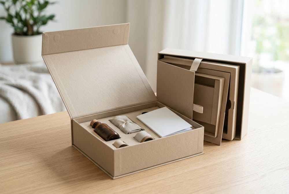
Insert strategies that keep mixed assortments organized and visually appealing
Inserts determine whether a subscription box feels curated or chaotic. They perform two jobs at once: they control movement in transit and they choreograph the visual reveal. For mixed assortments, the insert must support different item dimensions without appearing improvised. This is especially important when the box contains products that naturally clash in form, such as jars beside flat sachets, bars beside leaflets, or tools beside fragile accessories.
One useful strategy is modular zoning. Instead of cutting precise cavities for every single item, the insert divides the box into functional areas: upright bottle lane, flat literature layer, accessory compartment, and flexible zone for changing items. This approach works well for monthly subscriptions because it gives the packing team a familiar logic even when the assortment shifts. It also helps the customer see a clear layout on opening rather than a pile of disconnected products.
Another strategy is tiered presentation. A top card or paperboard tray can create a first reveal, while secondary items sit below. In beauty and wellness categories, this is effective for highlighting hero products before secondary samples are uncovered. For hobby kits, a layered insert can separate instruction materials from tools and consumables. In snack subscriptions, compartment boards or folded paper dividers can keep sweet, savoury and premium trial items from crushing each other.
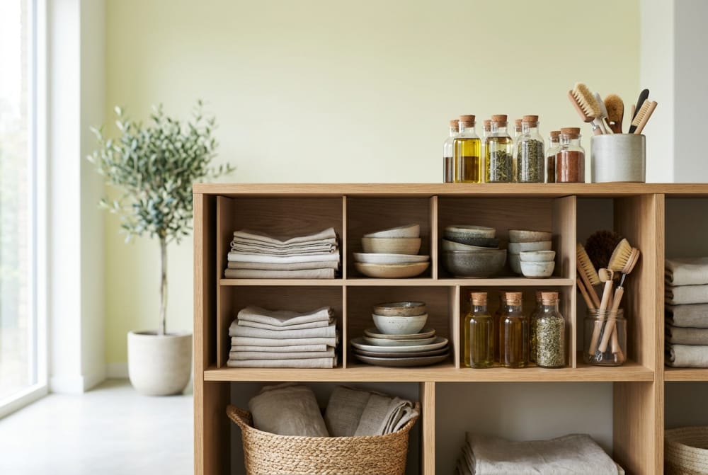
Material choice matters. Fibre-based inserts are increasingly preferred in the United Kingdom because they support recyclability messaging and reduce the perception of unnecessary plastic. Corrugated fitments, card partitions and moulded pulp all have roles depending on product weight and fragility. However, neat execution is essential. A sustainable insert that looks rough or collapses easily can undermine the premium feel of the box.
Visual order is just as important as physical order. Brands should think about colour balance, visible branding, and the first item a subscriber sees on opening. If all products are hidden behind too many layers, the box can feel cumbersome. If everything is fully exposed and loosely packed, it can feel cheap. The most memorable unboxing experiences use inserts to create a tidy reveal with one focal point and a natural sequence of discovery.
| Insert type | Main benefit | Visual effect | Best use case |
|---|---|---|---|
| Die-cut board insert | Precise hold for standard product sizes | Clean and premium | Beauty bottles and jars |
| Compartment divider | Keeps assorted items separated | Orderly and practical | Snacks and mixed goods |
| Layered tray | Creates staged reveal | High perceived value | Premium wellness and gifting |
| Wrap band or belly | Bundles smaller items together | Simple and tidy | Hobby accessories |
| Moulded pulp support | Improves protection for fragile items | Natural and robust | Glass containers |
| Paper shred plus card zones | Adds cushioning with lower tooling cost | Soft, gift-like presentation | Short-run campaign boxes |
| Removable top platform | Hides secondary items below | Dramatic reveal sequence | Launch boxes and PR editions |
For brands considering broader presentation upgrades, integrated inserts are often paired with gift packaging formats to increase perceived value without changing every operational process. The key is to choose an insert logic that can survive monthly assortment changes and still look composed on arrival.
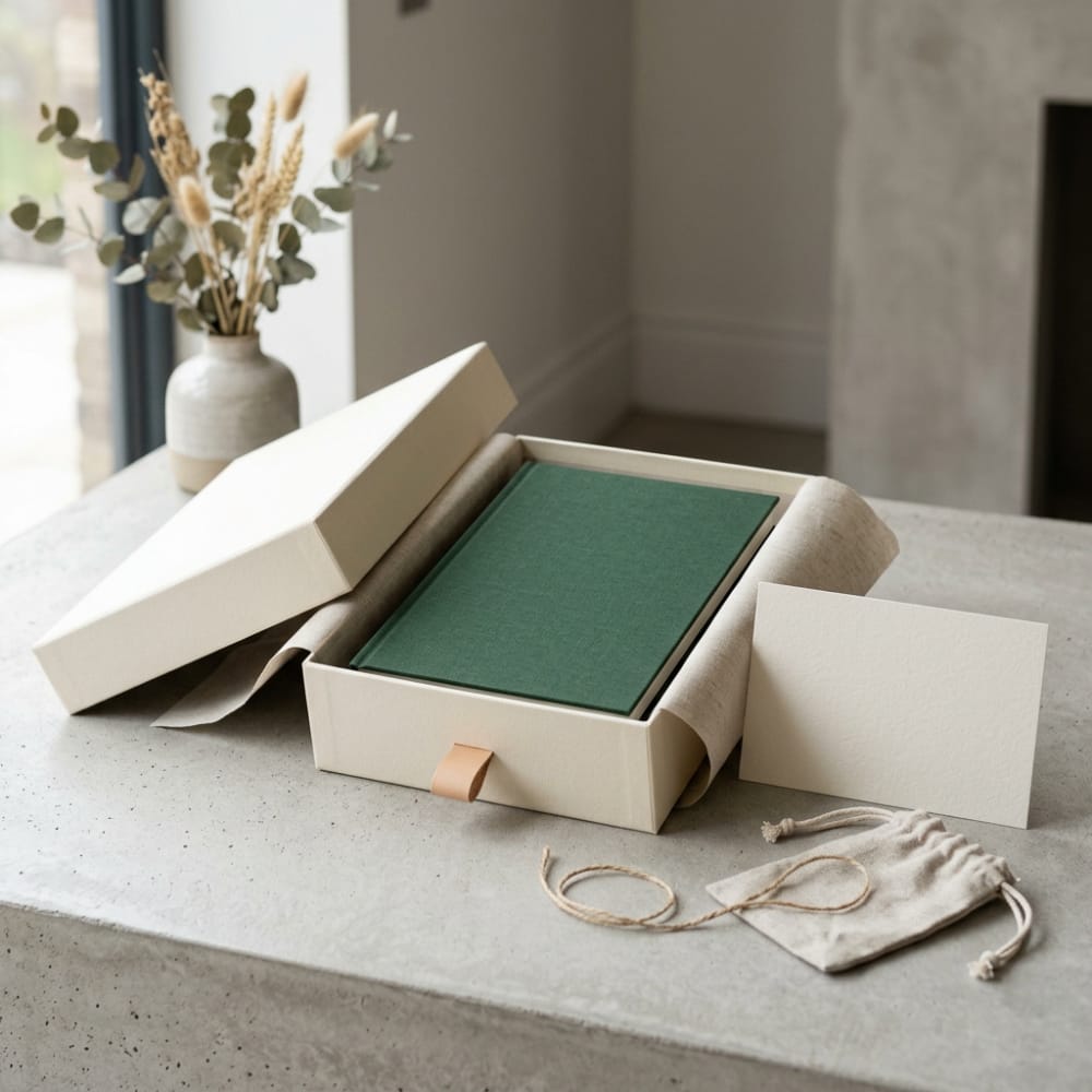
How storytelling, print, and presentation shape the unboxing experience
Unboxing is not just about the container; it is about the sequence of information and emotion inside the pack. Storytelling gives the customer context for why these products were selected together, what the month’s theme means, and how the brand wants the subscriber to feel. In subscription commerce, that narrative matters because the customer has already purchased. The packaging’s role is to confirm that renewing was the right decision and to build anticipation for the next delivery.
Print can do this quietly but effectively. Interior lid messages, seasonal pattern changes, origin stories, routine cards, tasting notes and QR-led content pathways all add substance. A snack box may use short sourcing stories that mention ingredients from Cornwall or artisan producers around Edinburgh. A wellness box may introduce a monthly reset theme with prompts linked to changing daylight or work routines in cities such as London or Manchester. A hobby box may use illustrated step sequences that reduce intimidation for beginners. Good print creates cohesion among products that may come from different suppliers.
Presentation choices should also reflect the category promise. Beauty subscriptions often benefit from cleaner layouts, stronger colour direction and a mirror-like sense of order. Snack boxes can feel warmer, more abundant and more energetic. Hobby packs work well when the interior feels methodical, almost like opening a kit. Wellness boxes often combine softness and calm with practical guidance. The packaging should therefore interpret the brand promise rather than simply display a logo.
Even small details can influence perceived quality: where the product card sits, how tissue opens, whether the sticker tears cleanly, whether the tray lifts smoothly, and whether copy is concise enough to read during a first interaction. Repetition also builds memory. If the subscriber always sees a signature line inside the lid or a recognisable monthly card format, that consistency becomes part of the brand identity.
A memorable unboxing does not require excessive embellishment. In fact, overloading the package with too many printed messages, filler pieces or decorative layers can reduce clarity and create waste. The strongest systems use a few well-chosen presentation elements and execute them consistently across editions.
Sticker applications for themes, personalization, and flexible monthly editions
Stickers are one of the most adaptable tools in subscription packaging because they allow visual change without requiring a full packaging redesign. In practical terms, they help brands update seasonal themes, segment subscriber types, personalise messages and manage limited runs. For UK subscription businesses balancing efficiency and freshness, stickers are often the most cost-effective bridge between stock-based packaging and fully customised monthly boxes.
There are several smart applications. A themed closure sticker can shift monthly artwork without changing the structural box. A subscriber-name label can create a more personal feel for premium plans or gifting. Colour-coded item or insert stickers can help packers identify edition variants quickly. Limited-run collaborations can also be signalled through high-impact labels placed on sleeves, tissue or outer panels. This is particularly useful when campaigns need to launch quickly, such as influencer drops, festive edits or trial subscriber acquisition boxes.
From a fulfilment standpoint, stickers can also support accuracy. For example, monthly variants for vegan, gluten-free, fragrance-free or beginner-level assortments can be identified by a simple but disciplined label system. This helps prevent cross-packing errors while keeping the outer box format standard. In busy operations, clear label logic often saves more time than an overly complicated printed packaging matrix.
Design quality matters here as well. Stickers should feel integrated with the packaging, not like an afterthought. Finish, adhesive quality and placement all influence perception. A poorly aligned label can make a premium box look rushed. A well-produced label can make a plain base pack feel campaign-specific and intentional. Businesses developing monthly sticker programmes often use custom sticker production to support short-run themes, seasonal graphics and clearer variant management.
As sustainability expectations rise in the United Kingdom, brands should also consider adhesive compatibility and recyclability communication. The goal is to use stickers where they add storytelling or operational value, not simply as decoration. In 2026, smarter sticker use is likely to include variable data, serialized subscriber campaigns and scannable codes for reordering, loyalty and digital content.
Packaging differences across beauty, snack, hobby, and wellness subscription models
Subscription packaging is not one-size-fits-all because each category carries different risk factors, product mixes and emotional expectations. Beauty subscriptions often contain small but high-value products where visual refinement is essential. Snack subscriptions prioritise abundance, freshness perception and crush resistance. Hobby boxes need organisation and instruction clarity. Wellness subscriptions frequently combine functional products with a calmer, ritual-based presentation.
Beauty boxes typically benefit from compact inserts, neat cavity spacing and strong emphasis on reveal order. The category often includes liquids and glass, so leakage prevention and upright presentation are important. In the UK market, beauty consumers also respond strongly to tactile finishes, interior print and reusable-feel boxes, especially in premium tiers.
Snack subscriptions have a different brief. They need efficient loading, food-safe handling logic and enough internal support to prevent pouches and bars from arriving crushed. Because SKU sizes can vary dramatically month to month, adjustable dividers are often more practical than highly specific cavities. The presentation should still feel generous, but the engineering must prioritise safe transit through national courier systems.
Hobby boxes often contain the most varied assortment of all. Tools, paper goods, paints, threads, small hardware or instructional materials may need to coexist in a single monthly kit. Here, a structured internal map becomes critical. If customers cannot quickly understand where each item sits or how the project begins, the experience loses momentum. Clear compartmenting and print guidance are especially valuable.
Wellness boxes usually rely on atmosphere as much as utility. They may include teas, supplements, body products, candles, journals or routine cards. This category often benefits from softer presentation, layered discovery and a coherent monthly narrative. However, wellness subscribers also notice waste quickly, so the packaging must look thoughtful rather than excessive.
The bar chart compares realistic demand levels by sector. Beauty and snack subscriptions tend to invest earliest in custom packaging because presentation and assortment control directly influence repeat purchase and customer referrals.
| Subscription model | Primary packaging need | Main risk | Best structural response |
|---|---|---|---|
| Beauty | Premium reveal and product protection | Leaks, scuffs, loose items | Die-cut insert with layered card |
| Snack | Efficient loading and product separation | Crushing and untidy presentation | Compartment dividers and strong mailer |
| Hobby | Organisation and instructional clarity | Missing parts and confusion | Zoned tray with printed guidance |
| Wellness | Calm, curated brand feel | Over-packaging perception | Soft layered presentation with fibre fitments |
| Pet care | Durability and varied item handling | Tearing and scent transfer | Corrugated box with grouped bundles |
| Book and stationery | Corner protection and neat stacking | Edge damage | Wrap support and snug sizing |
This comparison helps buyers avoid copying packaging cues from the wrong category. A structure that works beautifully for a skincare subscription may be inefficient for snacks, while a practical food divider may look too basic for a premium wellness offer.
Design choices that support faster fulfillment with fewer packing mistakes
Fast fulfilment does not happen by accident; it is designed into the packaging. The strongest subscription programmes reduce decision-making at the packing bench. When the outer box, insert layout, product sequence and label logic are predictable, temporary staff can be trained faster and peak-season operations become more stable. This is particularly relevant for UK businesses shipping from shared fulfilment sites around the Midlands, Greater Manchester and the South East, where labour efficiency and throughput matter intensely during campaign windows.
One of the most useful design choices is visible product mapping. If each zone in the box has a clear purpose, packers can identify missing items quickly. Another is orientation control. Bottles, sachets, cards and accessories should have obvious placement directions, reducing the chance of random packing. Colour coding can help too, but it should be used sparingly and consistently so it does not create visual clutter.
Structural simplicity also matters. A beautiful box that takes too long to erect, fold or close may cost more in labour than it saves in presentation value. Subscription packaging should be judged not only by how it looks on a customer’s table, but by how quickly it can be assembled across hundreds or thousands of units. A practical design often includes self-locking features, straightforward insert placement, and enough tolerance for product variation without causing jams or damaged corners.
Clear differentiation between variants is another major factor. If the same month includes standard, premium and gift subscriptions, the packaging should help the warehouse distinguish them without relying solely on memory. A sticker, print cue or insert colour can do this effectively. However, the differentiation should appear in a fixed and standardised position every time.
In 2026, fulfilment-friendly design will increasingly intersect with policy and technology. Brands are expected to provide clearer recycling communication, reduce unnecessary components and make EPR-related data easier to manage. At the same time, digital print, variable data labels and warehouse scanning tools will allow more precise variant control without a full redesign of the primary box.
The area chart illustrates the shift toward more organised and brand-led subscription packaging. As subscription volumes grow, businesses increasingly adopt insert systems and better variant controls to improve speed and reduce errors.
| Design decision | Fulfilment benefit | Error reduction value | Notes |
|---|---|---|---|
| Fixed packing sequence | Speeds staff training | High | Especially useful for seasonal temporary teams |
| Zoned insert layout | Makes missing items obvious | High | Best for mixed assortments |
| Variant sticker coding | Separates edition types quickly | High | Important for dietary or premium variants |
| Self-locking box style | Reduces assembly time | Medium | Good for higher volume runs |
| Right-sized outer box | Less void fill and movement | Medium | Also lowers freight inefficiency |
| Printed placement guide | Supports consistent presentation | Medium | Useful for complex hobby or beauty kits |
| Reduced component count | Fewer handling steps | Medium | Helps both cost and speed |
This table shows that the operational gains from good subscription packaging can be substantial. Faster packing, simpler training and fewer mistakes often justify customisation earlier than brands expect.
What makes subscription packaging feel disposable instead of memorable
Subscription packaging starts to feel disposable when it appears generic, oversized, inconsistent or careless. Customers notice these signals quickly. If every month arrives in an undistinguished stock mailer with loose products, no clear reveal and minimal brand expression, the delivery becomes transactional rather than memorable. That may be acceptable for low-cost commodity shipments, but it weakens retention for curated subscription models.
Oversized boxes are a frequent problem. They make the shipment feel underfilled, increase movement in transit and create the impression that the brand is not paying attention to detail. Weak interior organisation has a similar effect. Products tossed together without hierarchy can look like leftover stock rather than a curated collection. Even when the products themselves are good, poor presentation lowers perceived value.
Another issue is visual inconsistency without purpose. Monthly freshness is important, but if every edition looks unrelated to the last, subscribers may not build a strong memory of the brand. The solution is not sameness; it is a recognisable framework with room for variation. Consistent structure, opening ritual and typographic tone can coexist with changing themes and artwork.
Cheap print execution also matters. Fuzzy graphics, weak colours, peeling stickers or flimsy cards make the experience feel temporary. By contrast, a simple box with tidy print and coherent materials can feel far more premium than a more decorated package executed poorly. The same principle applies to sustainability. If the package uses excessive filler or too many unnecessary layers, customers may see it as wasteful rather than generous.
Ultimately, memorable subscription packaging earns attention because it shows intent. The subscriber can tell that the brand has considered fit, sequence, message and handling. Disposable-feeling packaging gives the opposite signal: that shipping was treated as an afterthought.
When it makes sense to upgrade from stock mailers to custom packaging
Not every subscription brand should move to custom packaging immediately. Stock mailers still make sense during early-stage testing, limited trial runs or proof-of-concept launches where product-market fit is not yet established. They can also be practical when assortments are still highly unstable or when order volumes are too low to justify tooling and printed inventory. However, there comes a point when the hidden costs of generic packaging begin to outweigh the apparent savings.
That point often arrives when monthly order volumes stabilise, customer acquisition costs increase, and retention becomes more valuable than short-term packaging savings. If a business is spending heavily to win subscribers, it makes little sense to undermine first-month perception with an ordinary shipping box. Likewise, if fulfilment errors, breakages or untidy presentation are causing complaints, a custom structure can address those issues directly.
Another signal is operational strain. If the warehouse regularly improvises void fill, repacks products to stop movement, or spends too long identifying variants, the packaging system is no longer fit for purpose. At this stage, moving to a custom box, insert set or label architecture often improves both brand perception and packing speed. Seasonal gifting demand is another trigger; a stock mailer that works for basic subscriptions may not convert well during Christmas or Mother’s Day campaigns when presentation expectations are higher.
For UK brands, supplier choice is part of the upgrade decision. Buyers should look for a packaging partner that can support prototype development, material guidance, print consistency, quality checks and flexible production quantities. A workshop equipped with advanced machinery can deliver more precise cutting, cleaner finishing and better repeat consistency. Strong manufacturing capability matters when the same format needs to perform month after month. Service capability matters too, because subscription programmes often require rolling changes, mixed batch sizes and responsive scheduling.
From a technological capability perspective, advanced converting and printing equipment makes it easier to maintain alignment, colour control and structural accuracy across recurring runs. From a manufacturing capability perspective, disciplined material selection and final inspection help ensure that each box and insert performs consistently. From a service capability perspective, flexible support for both small-batch customisation and larger production schedules is especially useful for UK subscription brands balancing launches, campaigns and recurring replenishment.
The comparison chart highlights why many growing brands eventually move beyond stock mailers. Custom formats usually deliver stronger brand memory, better campaign flexibility and lower packing errors, especially once volumes become predictable.
Buying advice for UK subscription brands
Buying subscription packaging in the United Kingdom is easier when the brief is specific. Brands should prepare a twelve-month view of SKU variation, target quantity bands, fragile-item ratios, desired opening style, sustainability requirements and fulfilment conditions. They should also decide which elements need to change monthly and which should remain fixed. This reduces unnecessary redesign and makes supplier conversations much more productive.
| Buying question | Why it matters | Good answer | Warning sign |
|---|---|---|---|
| What products must fit over 12 months? | Defines the core structure | Range-based dimensional brief | Designing only for one month |
| What changes monthly? | Controls complexity and cost | Artwork or stickers change, box stays stable | Full redesign each edition |
| What courier environment applies? | Drives board strength and protection | Known parcel route and handling risk | No transit assumptions tested |
| What fulfilment speed is needed? | Influences assembly style | Pack-friendly structure with clear sequence | Labour-heavy construction |
| What sustainability claims are realistic? | Affects materials and messaging | Right-sized recyclable components | Vague or excessive claims |
| Can the supplier scale with campaigns? | Prevents service bottlenecks | Supports small and large runs | Rigid quantity limits |
| How is quality checked? | Protects repeat consistency | Material and final inspection controls | No clear QC process |
This table helps buyers ask commercially useful questions. Subscription packaging is rarely successful when chosen on appearance alone; it needs to support logistics, repeatability and campaign agility.
Case studies and local supplier thinking
A beauty subscription assembled near Birmingham may prioritise rapid distribution to London, Bristol and Leeds, using one premium mailer with a die-cut insert and monthly interior cards. A snack brand shipping from Greater Manchester may prefer a stronger corrugated outer with compartment dividers and seasonal stickers to distinguish vegan and standard editions. A hobby kit business supplying customers across Glasgow, Newcastle and Sheffield may choose a zoned tray and illustrated top sheet to reduce customer confusion and support repeat completion. These examples show that local logistics and category needs shape the best structural answer.
When evaluating local or export-oriented suppliers serving the UK market, brands should compare not just price but repeat quality, print stability, flexibility on batch sizes and the ability to deliver a coordinated set of boxes, paper packaging and labels. A supplier with strong technological capability can support clean conversion and reliable print registration. A supplier with strong manufacturing capability can maintain material discipline and consistent finishing. A supplier with strong service capability can accommodate pilot runs, rolling replenishment and design adjustments as campaigns evolve.
Our company for subscription packaging programmes
For UK brands building monthly subscription formats, our role is to turn packaging into a dependable operating system rather than a single attractive sample. We support custom gift boxes, paper boxes, stickers and broader packaging solutions with attention to how they will actually be packed, shipped and experienced by subscribers.
From a technological capability standpoint, our workshop uses advanced machinery to support accurate converting, cleaner finishing and dependable repeat results across recurring projects. This is especially useful for subscription packaging where misalignment, poor fit or inconsistent die-cutting can quickly affect both presentation and fulfilment speed.
From a manufacturing capability standpoint, we focus closely on material choice and final inspection so that each batch meets the required specification. That matters for UK subscription programmes where every monthly run needs to feel familiar in quality, even when campaign artwork or product assortments change.
From a service capability standpoint, we are set up to support both small-batch customisation and larger-scale production with a flexible and efficient approach. This helps brands test new subscription concepts, expand into seasonal editions and scale repeat shipments without losing control of the packaging experience.
FAQ
What is the best box style for a monthly subscription?
There is no single best style, but a repeatable mailer or folding rigid-feel structure with a modular insert usually performs well because it balances consistency, protection and monthly variation.
Are custom inserts worth it for mixed products?
Yes, especially when mixed assortments cause movement, breakage or messy presentation. Inserts also reduce packing mistakes by giving each item a logical place.
Can stickers replace full monthly reprints?
Often, yes. Stickers are an efficient way to introduce themes, personalisation and variant coding without changing the whole box each month.
When should a UK brand move beyond stock mailers?
Usually when order volumes stabilise, retention becomes a priority, or operational inefficiencies such as breakage, slow packing or variant errors begin to affect customer experience and margin.
What trends will matter most in 2026?
Expect more recyclable fibre-based designs, stronger EPR and sustainability compliance, better use of variable data and QR-linked print, and more packaging systems designed around both fulfilment automation and subscriber retention.